The Team
Publications
Studying Color Blending for Visualizing Social Artifacts. In Proceedings EPCG2014.
Studying The Perception of Color Components’ Relative Amounts In Blended Colors. In Proceedings NordiCHI2014.
Studying Color Blending Perception for Data Visualization. In Proceedings Eurovis 2014.
Guidelines for Using Color Blending In Data Visualization. In Proceedings AVI 2014.
Reports
EduVis - Visualização de padrões provenientes de dados educacionais. Technical Report INESC-ID, 2014.
Related Research
Educare: Visualizing Educational Data Mining Patterns
Funding
Will It Blend: Studying Color Blending Perception for Data Visualization
Visualization is a powerful way to convey data, showing a great potential for joining and interrelating different data items. Nevertheless, when dealing with large amounts of data, visually merging different classes of information poses several challenges. Color, however, due to its effectiveness for labeling and categorizing information, may be a solution to this shortcoming.
However, color has traditionally ben used to encode the value of one variable. Tools like ColorBrewer are very helpful when designing color schemes for both categorical and quantitative data. Gradient scales are common for continuous variables. In all cases, though, we are encoding just one value, with color. The need might arise, however, to encode more than one value. Imagine a situation where two items, each with color from a different scale, are merged (one is used as a filter criteria for the other, etc.). A practical case: you have calendar view that is a heatmap representing how often you emailed Jack (using a blue gradient), and another which is a heatmap for how often you sent messages about "potatoes" (in red). It can make sense to get a heatmap of emails to Jack about "potatoes" in purple, a mix of the two.
This approach, while generating an immediately perceivable way to represent merged items, keeps context through the association of the resulting color to its original provenance. However, this will only work well if the users are able to identify that purple as having originated in red and blue, so that they associate it both to Jack and "potatoes" at the same time. Is this possible? With which colors?
We studied to which extent color blending provides users with the means to understand the provenance of data items by conducting a set of studies to ascertain (i) to which extent people are able to, given a particular color, understand which colors were mixed to produce it, (ii) the color model in which to perform natural color blending, (iii) the color pairs that are best suited for color blending and (iv) the perception of the relative amount of each color component in a mixed color. Results have shown that the CIE-LCh model provides best results for natural color blending, particularly regarding the (red, yellow), (green, yellow), (blue, green) and (blue, red) color pairs. Furthermore, when blending two colors our of these color pairs, humans are able to perceive the relative amount of color if a total of 5 steps are considered: (1) the first color in a 100% proportion of the first color; (2) a 75%-25% proportion; (3) an equal proportion of both colors; (4) a 25%-75% proportion; (5) the second color in a 100% proportion.
The problem

Color is a sensation produced in the brain which, if related to measurable phenomena, allows digital representation. The human eye contains three types of cones sensitive to light with different wavelengths, which resulted in the trichromatic color theory, stating that any color can be specified by the weights of red, green and blue color components. Hardware-oriented color models are RGB (red, green, blue) and color-printing devices are usually CMY(K) (cyan, magenta, yellow, (key)). However, these models fail to provide a color perception description, unlike the HSV (hue, saturation, value). The latter, however, fails to provide perceptual uniformity similar to human vision. The CIE-LCh model overcomes this limitation by assigning a perceptually uniform scale to lightness.
If effectively represented, color has great potential. However, due to the high quantities of data produced by human activities, available information is often extremely rich. One interesting technique for multi-variate visualization is color blending, where each variable is assigned a different color and the color of the resulting data is computed as the weighted sum of the original colors. Various authors have studied different color blending techniques and a number of researchers have also considered color blending for visualization and compared it to other techniques.
Even though CIE-Lab is a perceptual-based color-space, linear interpolations within it do not maintain saturation, even though brightness is uniformly blended. Contrarily, in CIE-LCh, saturation and brightness are perceptually uniform. As a result, performing color blending in this model may improve color blending outcome. Additionally, previous work has focused on recognizing data properties through color in a particular context. Although relevant in such particular contexts, previous research has not specifically studied to which extent users are capable of perceiving data properties of a particular data item, created by merging two other data items with particular colors associated to their properties. We aimed at doing so, by ascertaining how users are capable of choosing the original colors that were mixed into a particular blended color, out of a limited set of original colors, taking different color models into account. We designed the study so that it would provide us with information on: (i) which color model to perform perceptually-natural color blending, (ii) the color pairs that yielded good results when blended together, and (iii) which extent to perform color blending so that the relative amount of each component would be perceivable by humans.
Will it Blend: A Preliminary Study
We took advantage of the potential of color to depict visual information and considered the problem of merging different sets of data. To find if users can tell the original colors of a blend and in which color space is the blending more intuitive, we designed and performed a user study.
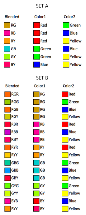
Despite color coding being excellent to display category information, only between about five and ten codes can be rapidly perceived. Taking the opponent process theory into account, we chose as main colors: (R: Red; G: Green; B: Blue; Y: Yellow).
Since the CIE-LCh model represents a perceptual uniform color space, we first performed color blending using this model.
The first set of blended colors (set A) consists of the pairwise combinations of the main colors: RG, RB, RY, GY and BY. The second set (set B) consists of the triadic combinations of the main colors: RRG, RGG, RBG, RYG, RRB, RBB, RYB, RYR, RYY, GBG, GBB, GYB, GYG, GYY, BYB and BYY.
Our first study consisted of a four-step online questionnaire.
The first stage consisted of a questionnaire in which users were asked their age range, gender, education, nationality and country of residence.
On the second part, we performed a validated simplified 6-plate Ishihara test for color blindness detection.
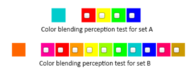
On the third part of our study, users were randomly presented with each color of sets A and B and asked to pick exactly two colors which mix into that color from a palette. Different palettes were assigned to each set, derived from the way each color was obtained. For set A, the color palette consisted of the four main colors, while the palette for set B consisted of both the main colors and colors from set A. Colors were displayed over a white background and each blended color was displayed individually, to avoid visual artifacts.
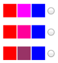
On the following step, we performed color blending in three different color spaces for all colors in sets A and B and asked users to pick the most natural transition: either HSV (additive, often used for color interpolation in visualization), CMYK (subtractive, which might be more intuitive give most people's experience with mixing paint or other pigments) and CIE-LCh (perceptually uniform). Lastly, a satisfaction questionnaire was performed where subjects were asked to rate, given a 5-point Likert scale (1 point = complete disagreement; 5 points = complete agreement), each of the following: (i) I found it easy to decide which pairs of colors resulted in a given color; (ii) I found it easy to decide the most natural blending option between two colors.
After designing our study, we created a web page with questionnaire, using HTML, CSS, Javascript and Perl/CGI technology. We broadcasted it on social networks and kept the questionnaire open for a week.
Study Results
We obtained 73 responses to our online questionnaire. The Ishihara test showed that all 73 participants (47 male and 26 female), have normal color vision. Regarding color blending perception, success rates, although not particularly encouraging in general, were higher for pairs containing (red, yellow) and (green, yellow) pairs, which correspond to smaller angles in the CIE-LCh color wheel, while lower success rates seem to correspond to wider angles. Correlations between angle amplitude and success were corroborated by Pearson bivariate correlation tests. Furthermore, blending three different components, led to extremely low results, showing that colors must be mixed in pairs.
Regarding color model preferences, results have shown that either CMYK or CIE-LCh models yield better results than the HSV model, which is an interesting result given the latter's prevalence in many applications. Moreover, there seems to be a slight preference for the CMYK model. Regarding the satisfaction questionnaire, participants found blending tasks difficult and experienced slight decision difficulties regarding the color model preference tasks.
Conclusions and Design Implications
We performed color blending using different models, finding evidence supporting the CIE-LCh model. However, in general terms, it does not differ significantly from the CMYK model, regarding user preference on perceived blending, although HSV yields significantly lower results. Despite the lack of strong statistical evidence supporting preference for the CMYK model, it may be promising. In fact, satisfaction results have shown that users did not find it intuitive to perceive original components of CIE-LCh-blended colors. Due to the use of subtractive color models based on pigment mixing in early childhood, many people may have an idea of color that is closer to the CMYK model. These implications may be verified by studying user performance on blending perception taking both CIE-LCh and CMYK models into account.
Will Ink Blend: Another Preliminary Study
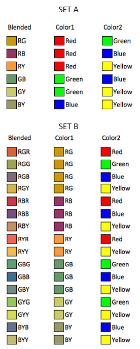
The previous study has suggested that the CMYK model might be promising for color blending representation. Hence, we performed a follow-up preliminary online study to investigate user performance on blending perception tasks regarding this model. The main goal of this study was thus to compare results obtained with the CIE-LCh model with those of the CMYK model to understand which is the best model in which to perform color blending.
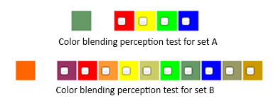
Using the same methodology that we has previously applied, we created pairwise (set A) and triadic (set B) combinations of the main colors (R: Red; G: Green; B: Blue; Y: Yellow). This study also consisted of an online questionnaire with practically the same structure as the "Will It Blend" preliminary study: it started with the same profiling questionnaire, followed by the validated simplified 6-plate Ishihara test for color blindness detection we used before. Then, similarly to the previous study, users were randomly presented with each color of sets A and B and asked to pick exactly two colors which mix into that color from a palette with the same structure as before. However, since colors were blended in a different color space, they appear different from those which were blended in the CIE-LCh space.
Lastly, a satisfaction questionnaire was performed where subjects were asked to rate, given a 5-point Likert scale (1 point = complete disagreement; 5 points = complete agreement), the following: (i) I found it easy to decide which pairs of colors resulted in a given color.
We created a web questionnaire, using HTML, CSS, Javascript and Perl/CGI technology to broadcasted our study on social networks. We kept the questionnaire open for a week.
Study Results
We obtained 44 responses to our online questionnaire. The Ishihara test showed that all participants (24 male and 20 female), had normal color vision. Regarding color blending perception tasks, success rates were slightly higher than those of the CIE-LCh model when taking set A (two color components) into account. However, for colors in set B (three color components), results were significantly lower than those of the CIE-LCh model. This indicates that the latter is more suitable for representing color blending in a way that is more natural to humans. Moreover, this study corroborate previous findings, showing that (i) Success rates are extremely low when more than two different color components are mixed; (ii) Some color pairs do not seem to blend well together, particularly "opponent" color pairs such as (green,red) and (blue, yellow); (iii) Some pairs do in fact blend best: (red, yellow), (green, yellow), (blue, green), (blue, red).
Conclusions and Design Implications
Having previously concluded that users do not find it intuitive to perceive original components in CIE-LCh blended colors, we conducted a user study to investigate whether the CMYK model, for being closer to human mental model of ink mixing in early chilhood, promotes better results. However, success rates for the CMYK model are generally lower than previous results, suggesting that the CIE-LCh model is more appropriate for color blending.
Preliminary studies have thus provided us with a set of conclusions and guidelines regarding the use of color blending for data visualization. Nevertheless, performing a study in controlled environmental settings, taking screen calibration into account will enable us to confirm our results and verify whether the same principles apply when visualizing information either in laboratory settings or in common, fluctuating everyday settings.
Studying Color Blending for Information Visualization
So that preliminary findings could be corroborated, we designed and conducted a new user study regarding color blending perception using both CIE-LCh and CMYK color spaces. This study took place in a lab setting, with constant luminosity conditions and taking screen calibration into account. Since the main objective of our study was to verify previous findings, we aimed at the following goals: (i) to verify to which extent people are able to understand the provenience of a given color resulting from the blending of two other colors; (ii) to determine if colors which yielded better results when blended together in previous studies are in fact the colors that blend best together and (iii) to ascertain whether the CIE-LCh is indeed the best color model in which to perform color blending.
The content of the study was very similar to both the preliminary studies. Hence, we considered the same sets of colors to be presented to participants. For each color model, CIE-LCh and CMYK, we performed the two aforementioned stages of color blending of the four main colors, resulting in sets A and B.
Our study consisted of six stages. On the first part users were asked the brief aforementioned profile questionnaire, followed by the same Ishihara color-blindness test. The third part consisted of color blending perception tests using the CIE-LCh model, similar to those performed on the "Will it Blend" preliminary study. On the fourth stage subjects performed color blending perception tests using the CMYK color model, similar to those described on the "Will Ink Blend" preliminary study. The fifth part consisted of color-space blending preference tests similar to those performed on the "Will it Blend" preliminary study. Lastly, a satisfaction questionnaire was conducted in which subjects were asked to rate, using a 5-point Likert scale (1=completely disagree; 5=completely agree), each of the two following statements: (i) On part 3, I found it easy to decide which pairs of colors resulted in a given color; (ii) On part 4, I found it easy to decide which pairs of colors resulted in a given color; (iii) On part 5, I found it easy to decide the most natural blending option between two colors.
We created a web page to perform our study as a six-step online questionnaire, using HTML, CSS, Javascript and Perl/CGI technology. We selected a laboratory setting with constant lighting conditions to perform our study. Tests were conducted with 30 participants. So that we could have more than one participant at a time, we used two laptops of the same brand and model, with the same display color calibration settings. Subjects were given a brief description of the study and asked to fill in each of the 6 steps of the questionnaire.
Study Results
Out of our 30 participants (25 male and 5 female), all had normal color vision. In terms of sucess rates regarding blending perception tasks in both color models, we verified the following: (i) In general terms, success rates for set A are slightly higher than previous results; (ii) Overall success rates for set B are slightly lower than preliminary test results.
Comparing both models showed: (i) Slightly higher results for the CMYK model regarding set A colors; (ii) Significantly higher results for the CIE-LCh model regarding set B colors; (iii) Slightly higher results for the CMYK model regarding the subset of set A which consists of the best blending pairs (red, yellow), (green, yellow), (blue, green), (blue, yellow); (iv) Significantly higher results for the CIE-LCh model regarding the subset of set B which consists of the best blending pairs; (v) In general terms, the CIE-LCh performs significantly better than the CMYK model.
Concerning color model preference tasks, results have shown a slight preference for the CIE-LCh model. However, satisfaction questionnaire results have shown that participants reported having slightly more difficulties on perception tasks when the CIE-LCh model was used for color blending.
Conclusions and Design Implications
This study, conducted in controlled laboratory settings, corroborated previous findings, concerning preliminary studies. Hence, we may conclude:
- (i) People are able to understand the provenience of a given color which results from the blending of two other colors provided: (a) the mixture consists of no more than two different colors; (b) the blended color does not consist of the mixture between colors that are complementary, that is, colors that are placed far apart in the color wheel (the pairs (red, green) and (blue, yellow));
- (ii) Colors that blended best in previous studies are still the best combinations (the pairs (red, yellow), (green, yellow), (green, blue) and (red, blue)). However, blending the main colors (red, green, blue and yellow) into pairs does in fact yield significantly better results than blending the main colors into trios, showing that the farther we blend colors, the more difficult it is to perceive original colors;
- (iii) Regarding color models, considering color pairs, perception performance for colors blended in the CMYK model is slightly, but not statistically significantly, higher than for colors blended in CIE-LCh color space. Taking color trios into account, perception performance is significantly higher for colors blended in the CIE-LCh model, when compared to colors blended in the CMYK color space. Furthermore, despite slightly (but statistically significantly) higher self-reported satisfaction regarding blending tasks in the CMYK model when compared to CIE-LCh, when performing the color blending model preference task, subjects have shown preference for the CIE-LCh model over the CMYK model. We may thus conclude that the CIE-LCh model is in fact the best color model for color blending.
Studying Relative Component Perception in Blended Colors
Having found the pairs of colors which blend best and the color model in which to perform color blending taking human perception into account, we need to know how to use color blending in a way that provides users with the most information possible. Having previously studied to which extent humans are able to understand the original color components of a blended color, we performed a further user study to find out whether people are able to perceive the relative amount of each color component. The main goal of our study was thus to verify to which extent people are able to understand relative amount of each color component that blends into a particular color.

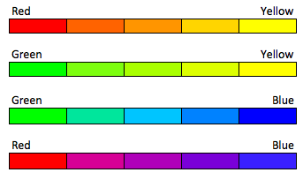
To find out to which extent participants are able to understand the amount of each component in a particular color, we blended each pair of colors ((red, yellow), (green, yellow), (green, blue) and (red, blue)). We used an 8-step interpolation so that there were a total of 10 different color mixtures for each pair, ranging from the first color component to the second color component. All colors in between had both color components, with uniformly decreasing quantities of the first color component and increasing quantities of the second color component. Applying this process to the the four color pairs ((red, yellow), (green, yellow), (green, blue) and (red, blue)) resulted in 10 colors for each pair, consisting of a total of 40 different colors, which we used in our study to find out how far are humans able to understand the amount of each color component in a blended color.

We conducted the user study in a laboratory setting with constant lighting conditions, using a single laptop, with a color-calibrated display. The study consisted of four stages. On the first part users were asked the previous profiling questions, followed by the simplified 6-plate Ishihara color blindness test. The third part consisted of presenting subjects with each of the 40 blended colors individually, in a random order, and asking them to rate it from 1 (only the first color component) to 10 (only the second color component). The fourth part consisted of a small satisfaction questionnaire in which subjects were asked to rate, using a 5-point Likert scale (1=completely disagree; 5=completely agree), the following statement: I found it easy to decide the amount of each color component in the given color. After designing our study, we created a web page to perform our study as a four-step online questionnaire using HTML, CSS, Javascript and Perl/CGI technology. We selected a laboratory setting with constant lighting conditions to perform our study. Tests were conducted with 20 participants. We used a single laptop for all tests, having performed display color calibration. Subjects were given a brief description of the study and asked to fill in each of the 4 steps of the questionnaire.
Study Results
Out of 20 participants (10 male and 10 female), all had normal color vision. User satisfaction questionnaire results showed that the majority of subjects found the it relatively easy to perceive color component weight.
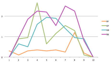
When analyzing results for the main task, the perception of color component weights in blended colors, we scored results as follows. We measured the deviation between the correct color and the answer provided by users, in terms of points. For instance, if the current sample corresponded to color 2 of the (red, yellow) pair (containing a high quantity of the red component and a low amount of the yellow component) and the participant labeled it as color 1 (which is pure red), the answer is classified with a deviation of 1 point. Correct answers correspond to a deviation of 0 points.
A set of trends emerge from deviation results: (i) The (red, yellow) pair showed much higher results when compared to all other pairs ((green, yellow), (green, blue) and (red, blue)); (ii) Colors in both extremes (pure colors) are easily perceived by subjects, for all color pairs; (iii) Regarding color pairs with lower results, hit rates for blended colors consisting of similar quantities of both components are relatively low; (iv) Interestingly, a particular trend in colors in which a significative amount of both color components are present ("central colors") does not seem evident but, in general terms, central colors are not easily distinguishable. Considering all color pairs, the global deviation corresponds to an average value of 0.92 points, suggesting that we must consider an approximate deviation of 1 point for each color pair. This result leads us to conclude that the a maximum of 5 colors must be taken into account when blending colors so that the relative amount of each color component is perceivable by humans.
Conclusions and Design Implications
Having found the colors which yield better results when blended together and the color model in which to perform color blending, we conducted this study to determine to which extent humans are able to understand the relative weight of different color components in a blended color. Hence, we may conclude:
- (i) When a pure color (a color that consists of only one component) is presented to subjects, they can easily understand that only one component is present;
- (ii) People tend to think of blended colors in which one component is in much a higher ratio than the other as pure colors, containing only the component with higher weight;
- (iii) Colors in which components are similar generate some confusion: humans tend to have difficulties in understanding the exact quantities of each color component (they only perceive that quantities are relatively similar).
- (iv) The aforementioned restrictions suggest considering carefully using color blending to represent relative quantities of any measured data. Using this method alone to present individual data items will probably fail to communicate all the information being coded through color.
- (v) Nevertheless, when the idea is to provide rough information of a data item presented individually, color blending may be successfully used. However, an important restriction must be applied: no more than three intermediate steps must be considered for color interpolation, in order not to prevent humans from perceiving component weight. Hence, a set of 5 colors for each color pair results from this process: the extremes correspond to pure colors, while the remaining elements correspond to 75%-25%, 50%-50% and 25%-75% component ratios.


