The Team
Try It Live!
Publications
EduVis - Visualizando a LEIC. Vilma Jordão. MSc Dissertation.
EduVis: Visualizing Educational Information. In Proceedings NordiCHI2014.
EduVis: Visualização Interativa de Dados Educacionais. In Proceedings EPCG2014.
Visualizing Large Quantities of Educational Datamining Information. In Proceedings IV2014.
Visualizing Educational Datamining Patterns. In Proceedings Eurovis 2014.
Multi-Level Visualization of Interrelated Data Entities. In Proceedings AVI 2014.
Reports
EduVis - Visualização de padrões provenientes de dados educacionais. Technical Report INESC-ID, 2014.
Related Research
Will It Blend: Studying Color Blending Perception for Data Visualization
Funding
Educare: Visualizing Educational Data Mining Patterns
Providing the educational community with tools to analyze educational processes may result in a more effective education. Applying Data Mining techniques to educational data results in information on educational settings which, however, comprehend an extensive set of symbolic patterns that are usually difficult to understand. Visualization, due to its potential to display large quantities of data, may overcome this limitation. We used the results of educational data mining techniques that had been applied to analyze the interdependence among courses in a university program and studied visualization mechanisms to enable the analysis of such patterns. A coordinated visualization has been created which takes advantage of two different, complementary, tools: a multi-layer visualization and a multi-matrix representation of courses and corresponding relationships. Having performed user tests in order to understand the best colors to use to represent information, we have assigned color codes to different degrees of success and failure and used color blending to represent multiple dependencies. User tests have shown the effectiveness of our solution to visualize educational patterns.

The problem
The number of students in both traditional and online education has experienced a considerable growth over the last decades. Regarding university students, numbers have increased considerably in a global scale. In fact, the global enrollment rate increased from 8.5%, in 1970, to 24.7%, in 2006. Concerning online education, the creation and profusion of free MOOC (Massive Open Online) courses in which students from all over the world may participate also contributed to a growth in the number of students worldwide. As a result, CMS (Course Management Systems) and LMS (Learning Managament Systems) became popular and had a great impact in the boost of distance education. Comprehending the effectiveness of a study program or a specific course means understanding how students succeed. Particularly, concerning university study programs, it is important to analyze different courses' success rates and how courses influence one another. This will help to track down and correct problems and limitations, eventually leading to better results.
With the growing number of students in both traditional education and online courses, a very large set of data emerges from students' curricula. This information, if explored effectively, may be crucial to improve education processes. The application of data mining techniques to educational information is an emergent research topic, providing the means to analyze data from educational settings, ranging from student behavior to teaching strategies and program coordination. EDM (Educational Data Mining) is an emerging discipline with the goal of applying data mining techniques to data that come from educational settings, like computer-based tutoring systems, or the traditional teaching process. In both circumstances, data hide students' usual behavior, process definitions and coordination, as well as teaching strategies, among other information. As a result, EDM provides relevant patterns based on available course information and makes it possible to make predictions based on educational data provided. However, this normally consists of an extensive set of behaviors that are described as textual patterns which are usually difficult to understand due to their visual complexity, making them difficult to comprehend and interrelate. However, this limitation must be overcome for EDM to be useful and effective. Providing the tools for allowing an easy and correct interpretation of information is, thus, of utmost importance.
Visualization has the potential to overcome this challenge: it an excellent means to display large quantities of data and alleviates cognitive load associated with information interpretation. As a result, the creation of a visualization that displays the results of educational data mining techniques will make it possible to provide the educational community with relevant, perceivable information. Study program coordinators and professors will thus be aware of problems that would otherwise remain unnoticed.
Data Mining Educational Patterns
We used the result of sequential pattern mining that had been applied to data gathered for nine years on an undergraduate study program on computer science on our university.
The goal of sequential pattern mining, given a set of sequences and some user-specified minimum support threshold, is to discover the sequences that exist in at least
σ sequences in the dataset (frequent sequences). Sequential pattern mining with three different support threshold values (50%, 25% and 20%) has been performed.
As a result, a number of textual patterns have been generated which observe the following structure:
Pattern_i = (semester_{1}, ..., semester_{N}, total_{students})
semester_j = course_1 || (course_1, ..., course_M)
Some examples are:
(fex, 2000): 2000 students completed fex on the first semester;
((fex, am1), tc, 1000); 1000 students completed fex and am1 on the first semester and tc on the second semester;
((fex, am1), (fisica1, tc), am2, 800): 800 students completed fex and am1 on the first semester then fisica1 and tc on the second semester and am2 on the third semester.
Even though textual information makes it difficult to understand particular patterns and perceive general trends, this pattern structure provides us with the means to gather information on course interrelations among different semesters that an effective visualization will be able to make evident.
Visualizing Educational Data Mining Patterns
We created a visualization that displays educational patterns in a way that makes them evident and easy to navigate and interrelate, allowing an effective analysis of educational information. The information to visualize is the result of EDM techniques that had previously been applied to analyze the interdependence of success among courses in an university program in the research project Educare context. These patterns provide us with the number of students that pass each course, as well as information regarding precedence and simultaneity relationships among courses. An example of a precedence relationship is: 100 out of the 200 students who failed course A on a given semester will probably fail course B on the following one. A simultaneity relationship could be: 80 out of the 100 students who were approved on course C on a given semester were also approved on course D on the same semester.
We created a visualization for representing a study program's set of courses, focusing on the interrelations among them.
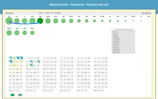
Multi-Layer Visualization: semester and course representation
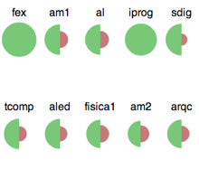
In this representation, each layer depicts one semester of a study program, displaying courses as circles or, when data on failure is available, the course circle is sub-divided into two semicircles with size proportional to success or failure: the green circle, on the left, represents the number of successful students and the rightmost, red circle, shows the number of students who failed the course, following conventional western color codes. This makes it possible to immediately understand the courses with high or low success rate as well as to visually compare course success and failure.
Multi-Matrix Visualization: semester and course representation
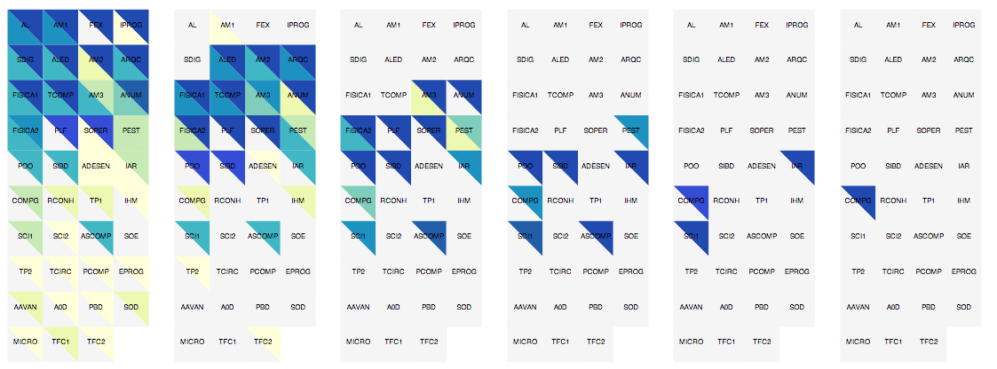
In this view, courses are represented as matrix squares, divided into two triangles: the upper for success and the lower for failure. Before interaction, courses with available patterns are represented in colors within the yellow and dark blue range, while the remaning courses are depicted in gray. Brightness represents the number of patterns in which courses are involved: the lower the brightness, the more relationships with other courses.
Interaction
When a course is selected by moving the mouse either over a circle or semi-circle (multi-layer view), or a triangle (multi-matrix view), information on that course is depicted. When a course is selected, detailed information on that course is displayed in the rectangular panel between the two views. If there is a high number of patterns for the currently selected course, a scrolling bar is automatically shown. Both views change according to the current selection.
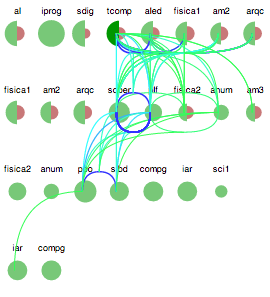
The multi-layer view highlights the current circle, increasing its saturation, and represents relationships between the current course and all others through visual connectors (cubic Bézier curves). Connector thickness is proportional to the number of students who verify the behavior: the thicker the line, the more students participate in the current pattern. Color conventions are used to assign color to curves: patterns related with success (originated from green semi-circles or green circles) range from blue (low number of students) to green (high number); patterns that arise from failure (red semi-circles) are represented in colors ranging from yellow (low number of students) to red (high number).
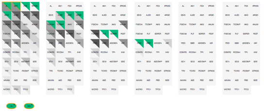
On the multi-matrix representation, changes are reflected primarily in terms of color, showing dependencies among courses. Blue and red show dependencies, corresponding to an approval-disapproval heat map: the upper, blue, triangle, is associated with approval, while the lower, red, represents failure. This mechanism highlights dependencies among courses, making them easily perceivable.
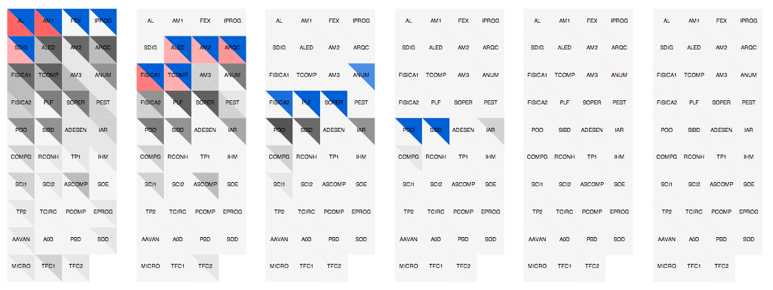
When a course circle is no longer selected, course information is cleared, so that the user may explore other courses. However, if the course (semi)circle or triangle is locked (by clicking the mouse over it), information regarding the current course's relationships does not disappear if the mouse leaves the (semi)circle or triangle. The user may then visit other course (semi)circles or triangles and corresponding information will be displayed, allowing simultaneous course comparison. Furthermore, the multi-matrix visualization allows the creation of filters. When a course has been previously selected and another, with common relations with the first, is selected, the visualization is restricted to courses with which both selected courses share one or more patterns, making a restriction on the initial set of interrelations of the first selected course. It is thus possible to add restrictions indefinitely. Filters may be added and removed at any moment of the interaction and information is updated on both the multi-layer and the multi-matrix views.
Evaluation
We conducted a study with 20 users, 15 (75%) male and 5 (5%) female to evaluate our visualization, of whom 50% are between 25-34 years of age. 80% of our participants attend or have concluded a university degree. Participants were given a verbal introduction to the study, then they were handed a list of questions to answer. Questions corresponded to representative tasks, regarding the goals of our visualization.
- 1. How many semesters are we representing?
- 2. In general terms, which courses have been completed by a higher number of students?
- 3. What is the set of courses involved in more positive patterns regarding the second semestrer?
- 4. What courses are inter-related with iar on the fourth semester?
- 5. Considering the students who completed am1 and fex on the first semester, which are the other courses in which they were successful in the second semester?
- 6. What courses are common to students who have passed sdig on the first semester and failed aled on the second semester?
- 7. Considering po on the fourth semester, despite it being the course with more associated patterns, is it the course with the highest number of students?
Time and number of errors were measured during evaluation. Subjects were then allowed to interact with our visualization, followed by a satisfaction questionnaire with two parts: the SUS (System Usability Scale) and a small set of questions to evaluate information gathering.
Results

Considering that questions 1, 2 and 3 correspond to tasks in which no interaction is needed (required information is visually available), measured time and errors do not allow the creation of a generalization for comparing immediate interpretation tasks (1, 2, 3) with exploration tasks (4, 5, 6 and 7), except possible for tasks 6 and 7. So that we could verify these findings we performed further statistical analysis. A Shapiro-Wilk test showed evidence against normality in most data, so we applied Wilcoxon signed-rank tests to find out significative differences among tasks. Results have shown that, regarding time, task 1 is significantly faster to perform than the remaining tasks and that all 2, 3, 4 and 5 tasks are completed in a significantly lower amount of time than tasks 6 and 7. Regarding the number of errors, we could only find differences between the task pairs (2,3), (2, 6), (4,6). Furthermore, we calculated Pearson coeficient to find out a possible correlation between time and number of errors, failing to find significative differences. These findings suggest that the visualization is effective, showing even when task temporal complexity is higher, the number of errors in task performance remains quite low. Taking the final satisfaction questionnaire into account and calculating the SUS score, we obtained a 79.47% point score, a very good evaluation score for usability and learnability. Using the same method for calculating task performance satisfaction, we obtained a 92.11% point score. In sum, evaluation yielded very promising results. Users were able to obtain information for task completion, while time and error rates showed that the system scales well for large amounts of information and that users easily learned how to use it and were quite satisfied. Such results prove the validity of our solution for visualizing educational patterns in a simple, effective way.


