

The Team


Mental Maps of Lisbon: A case study for the Semantic Cities Framework
In order to validate both the effectiveness and usefulness of the Semantic Cities Framework, we designed a case study to discover the different mental maps in the city of Lisbon, Portugal. Lisbon is a big enough city to have different ideas associated with different areas -- as in an "offices area", a "leisure area", etc. Furthermore, Lisbon sees its population almost double in size every workday when people living in adjacent cities move there to work. Add the tourism that's been growing at almost 10% every year for the last 5 years, and there's the possibility of very interesting results with a lot of different perceptions of space!
Designing the survey
Our case study followed the same basic approach as "Crowdsourced Neighborhood Boundaries", identifying different views on neighborhoods' boundaries, and Lisbon's boundaries, as the best way to uncover mental maps. However, we made sure to design the study to make it possible to explore, as much as possible, the reasons that led participants to their drawn boundaries. This was something that was missing from the mentioned project on Boston, and it can completely change how we see mental maps and space perception.
We began our survey by creating a first page where we would ask for the participant situation towards Lisbon, they could opt between:
- "I was born Lisbon and I still live there"
- "I lived in Lisbon"
- "I was born and lived somewhere else, then moved to Lisbon"
- "I don't live in Lisbon, but work/study there"
- "I visited Lisbon"
- "I never lived in, nor visited Lisbon"
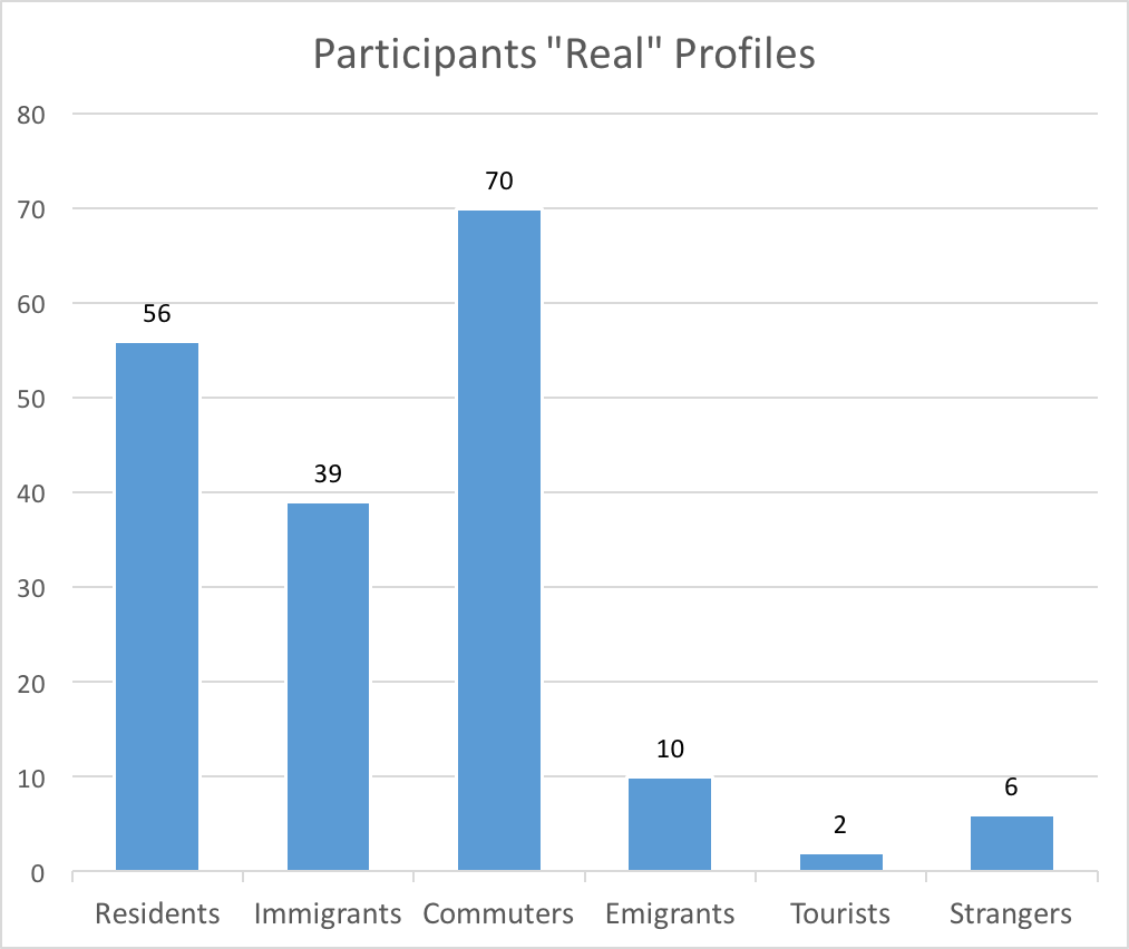
This separated right away the participants into 6 important groups, which we call, respectively: "residents", "emigrants", "immigrants", "commuters", "tourists", and "strangers". Each "type" of participant was led to a different page, customized to his/her situation, where basic background questions are made. The exception is for "strangers", who were dismissed right away, for not being useful to our study. For the others, we asked for age and most used type of transportation, regardless of the profile, since both seem relevant for every type of situation.
"Residents" were only asked for those two things, since we found no use of exploring anything else at that stage.
For "emigrants" we needed to classify their closeness with the city, and thus we asked for how long, and until when they had lived in Lisbon (someone who lived in Lisbon until recently probably has a different perception from other who lived there until the 80's, for example). We also wanted to separate Portuguese emigrants from others, and thus asked for their nationality. For both "immigrants" and "commuters" the same idea was followed, as we questioned participants about for how long they were living, or working, in Lisbon. "Immigrants" were also asked for their nationality.
"Tourists" required a greater number of questions, but all were made with the common goal of classifying their experience with Lisbon. To achieve this, after asking for their nationality, we asked them how many times they had visited Lisbon, an approximate total of days they spent in Lisbon, and a general classification of their visits to Lisbon (work/leisure).
These questions guarantee the existence of enough data to duly analyze drawn areas, offering the possibility of relating space perception with experience, age, or type of transport, or even all of them at once. However, we found the need of gathering more information on each participant. Based on previous research, besides the type of transport used, we knew that the place where one lives, and the places he visits most, also play an important role on space perception. To address this, we added two more steps to our survey: one where participants are asked to point, on a map, their living area, and another where they point several meaningful, or just frequently visited places.
The first step was basically the same for every type of participant but "commuters" -- who were led directly to the next step, since they don't live or heave lived in Lisbon.
For the second of those steps, we asked people who currently live, or work, in Lisbon for pointing important places, such as their work place, a friend's house or a family member's house where they spent more time, their favorite "cafes", or the most cherished sites. As for people who don't live in Lisbon anymore, we focused on referencing the places they still remember as being special and having any meaning. For tourists, we tried to direct them to point the places that marked them the most: a monument, a viewpoint over Lisbon, a particular street or garden, etc.
All of this offers a greater exploration over the results, and helps backing up claims and conclusions. A participant that points multiple meaningful places in a certain zone probably has a better perception of that area, and what he draws should be especially taken into account for showing how people familiar with that zone "feel about it".
In both these steps the markers have a buffer zone with a radius of 250 meters. With this decision, in conjunction with the guaranteed anonymity, we hoped to make an otherwise quite personal survey into a more relaxed one, where participants wouldn't hesitate to give out such personal information.
Finally, the three final steps challenged the participant to draw various boundaries on the map. First, Lisbon's official boundaries, then, the limit of different areas with which the participant feels familiar, and at last a step where one could choose multiple neighborhoods to draw.
The interaction is simple and the goal straightforward, we want to see what people think about the city's space, and thus our demand for the official boundaries of Lisbon to right away have a minimal insight on the general perception of what is Lisbon and what isn't. Next, the Lisbon with which the respondent is familiar with, provides the possibility of finding, through those boundaries, not only which parts of the city are more welcome to everybody's quotidian, but also which areas are still under-used or unexplored.
The neighborhoods phase had a more interesting creation process. To decide on the list of draw-able areas, we published a small online form beforehand, where respondents would simply list all of Lisbon neighborhoods or areas that came to their mind. The most mentioned ones, provided that they wouldn't overlap each other too much, were chosen to feature on our survey, making up a list of 48 areas that we trusted people would know well enough. Interestingly, the list ended up featuring, among neighborhoods, areas which have no official boundaries, and exist only on one's mental map. A good example of this is Lisbon's Baixa, which general area is known to everybody, but for which specific boundaries are not clear. Thus, in addition to official areas of parishes (known as "freguesias") that follow the idea of the "Crowdsourced neighborhood boundaries" study of Boston and its respective goal, we try to specifically uncover mental maps using this simple method of boundaries drawing.
We should add that, in order to restrain the amount of corrupt participations, we limited the area of the map to what we considered great enough boundaries to include honest opinions but eliminate junk data from less serious participants.
The Results
From March 15th until April 4th, 2016, we had 224 participations in our survey, although only 183 had at least some analyzable data. We attribute this latter phenomenon to the fact that the survey is not made for mobile, something we warn people about right on the welcome screen, and probably prompted them to exit the survey, leading to an empty registry on the database for that participation: accountable, but not analyzable. Furthermore, even though a sizable amount of people began the survey, not all of them completed it. Fortunately, the Semantic Cities Framework predicts such behavior, and registers each participation at the end of each step/phase. The survey being extensive, and possibly exhaustive for the cognitive weight it can have on some people, resulted in only 93 participants reaching the final "neighborhoods" step. From those 93, only 53 drew at least one neighborhood.
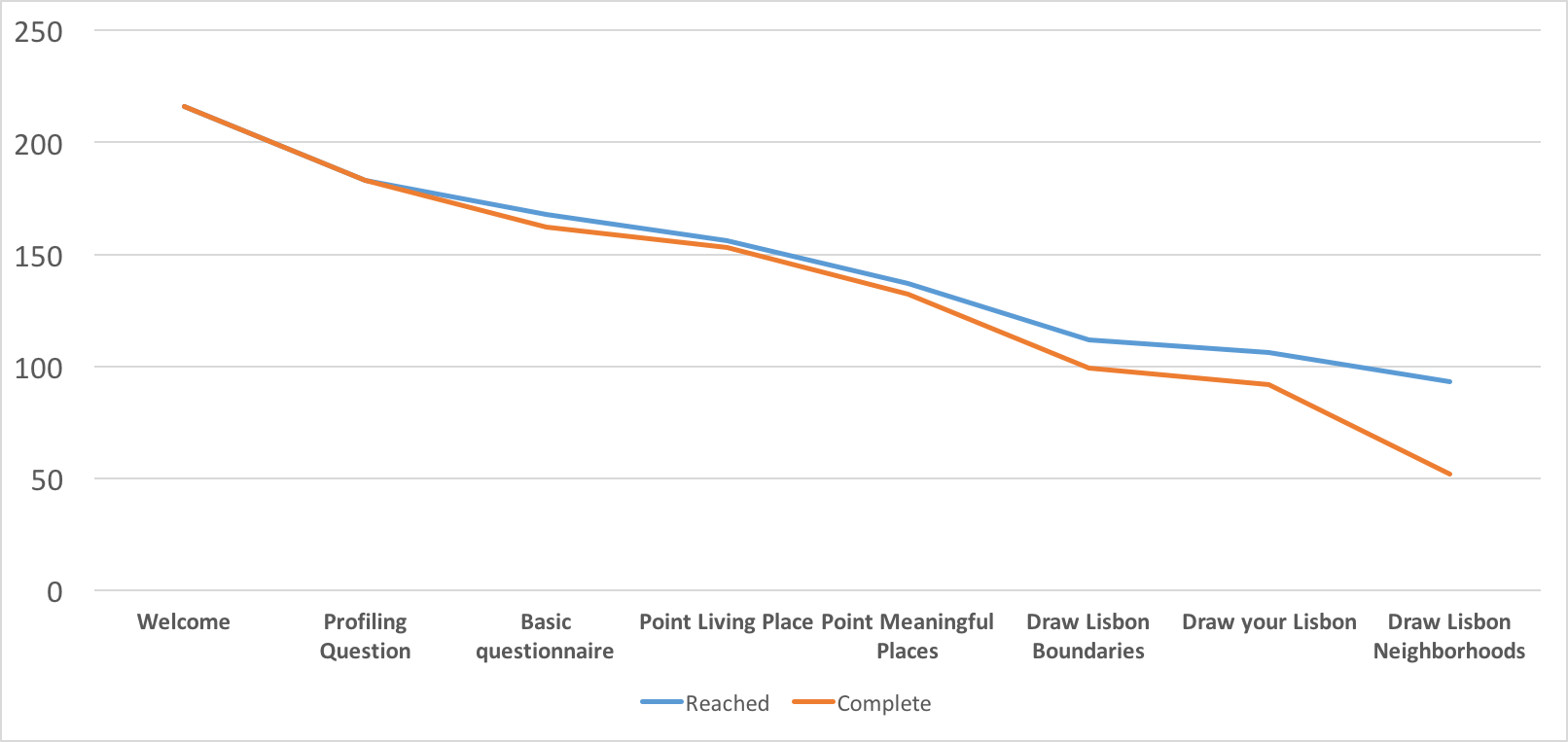
The figure above shows the progress of both the number of participants that reached a certain step and the number that completed it -- participants are allowed to skip each step if they want to, counting in as an incomplete participation, and thus the difference between those two metrics. Although a respondent can choose to try to quickly finish the survey and sacrificing precision in his/her answers, we suspect that these participants felt the pressure to ensure detail in each of the drawn areas. The drop of the "complete" line on the last step backs this theory, probably representing participants that felt tired of drawing on the map. Furthermore, for that phase in particular, confronted with such a great number of neighborhoods, the participants were probably stunned by the amount of drawings they thought they still had to do. Gathering all this together gives us the most probable answer to the quitting/skipping phenomenon. Future versions of this or similar studies may consider advantageous to present questions in random orders to different participants, ensuring a more uniform response level to all of them.
In spite of losing more than half respondents by the end of the survey, the absolute number of complete participations is still high enough to make some insightful analysis, and so we carried on with our work without worrying much more about pushing the survey to more people.
Participant's background
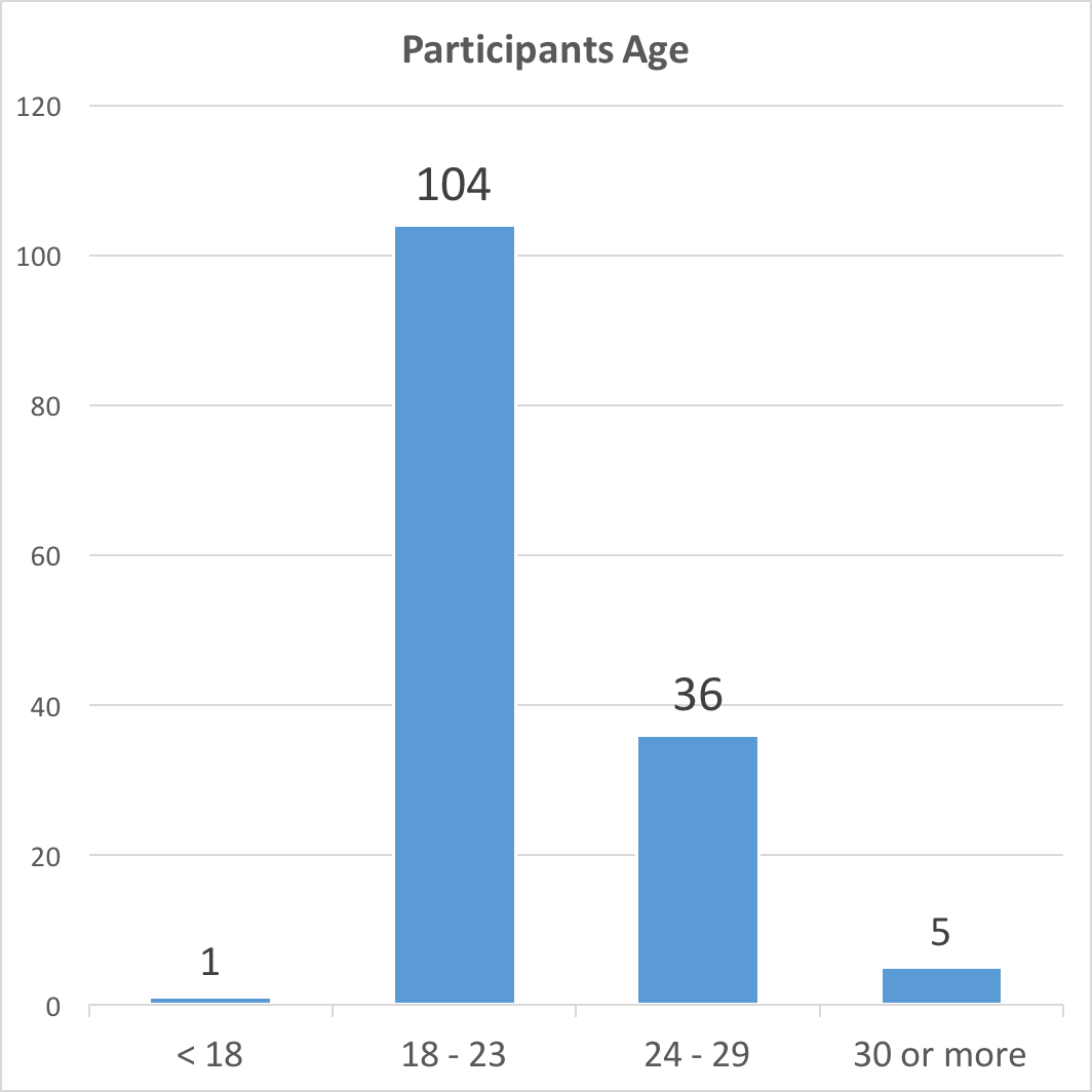
The survey was published in several social media circles, like Facebook Groups, some related with the city of Lisbon, but most of them directly related with our own college for the potentially big response. We also published on relevant sub-Reddits, such as "/r/SampleSize". As suspected, most participants probably originated from college, since almost 70% are in the range of "college age".
In terms of profiles, and based on the fact that the said college is located in Lisbon, participations were mostly from all time residents in the city, but other profiles such as "immigrants" and "commuters" also have an important share. We should also point the lack of "tourists" as unfortunate for a lot of possible observations. However, it didn't surprise us, since convincing in an impersonal way, such as over the internet, complete strangers is such a hard thing to achieve. The few responses we suspect that originated on Reddit, or Lisbon related groups, are from people already living in Lisbon. Future studies should take this into consideration and try to approach tourists in a more personal way, like distributing printed QR-codes on the street with a little verbal introduction.

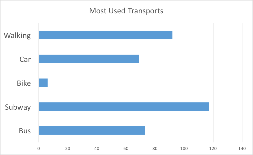
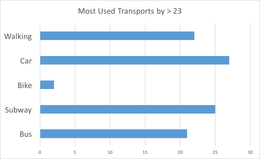
One question in common to every participant was about their most used types of transport, which they could choose one or more between "Bus", "Subway", "Car", "Walking", and "Cycling". The results, bellow, show that subway is the most commonly used transport system, followed by walking. However, taking into account the overall demographics and situation of our participants, such results were expected. By only analyzing the answers given by participants with more than 23 years suddenly the car plays the major role, although still close to the subway.
Participant's living area
Besides the previous factors, the place where participants live is also an important classification of the results, showing the overall tendency for answers on the remaining steps of the survey. We can see that most people said, again unsurprisingly, that they lived in the nearby area of the same mentioned college, see red hexagons in the figure bellow on the left. Besides those nearby areas, there's also the overall distribution throughout the more residential areas of Lisbon, such as Telheiras, Benfica, and the north-eastern area of the city.
The distribution of where participants said they live/lived. Red hexagons represent a 5% agreement on the hexagon's area, yellow hexagons represent a 2% agreement
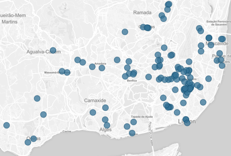
All the placed markers, representing where participants said they live/lived
There are some interesting observations to make, though, as several markers were placed in curious places. These include the inside of the college campus itself, and the river Tagus. We attribute this behavior to a number of possible situations.
First of all, recall that, even though we created a buffer zone around a marker to respect one's privacy, a person can still feel uncomfortable to give away such personal information as the place where she lives. There's also the possibility, concerning the markers inside the campus, that some participants joked with the fact that they almost live in there. Finally, another explanation is related with the curious fact that some people placed their living area outside of the borders of Lisbon, in adjacent cities such as Oeiras, Agualva-Cacém, or Algés (see figure above, on the right). These people are probably what we classified as commuters, but somehow didn't see themselves as so, to the point of saying they live, or have lived, in Lisbon -- the only way they could have gone through this step. This, allied with the fact that the map couldn't be panned over some pre-defined limits (see "Designing the Survey"), could have left some participants that live outside of those boundaries, with no other option than placing the marker in some meaningful or central area.
Those that stated they lived in Lisbon but their actual living places were put outside of its boundaries represent a group of at least 32 people, which gives us right away an idea of what many people identify as Lisbon. Under this observation, we should also note that the profile distribution of our population ends up looking like the one bellow.
Meaningful places and well-known areas
Even considering the corrupt data, it is still possible to generate a basic image of where most participants live, and what areas they are likely to know better. With this in mind, we moved on to tackle the relation between participants' backgrounds, and their perception of space.
First off, we must analyze how meaningful places differ among participations. The figure bellow shows, on the top left, the resulting distribution of meaningful places for the general case, where all types of participations were considered. We resort to a low-detail hexagonal grid, where each hexagon is color coded to the relative number of points placed inside that area.
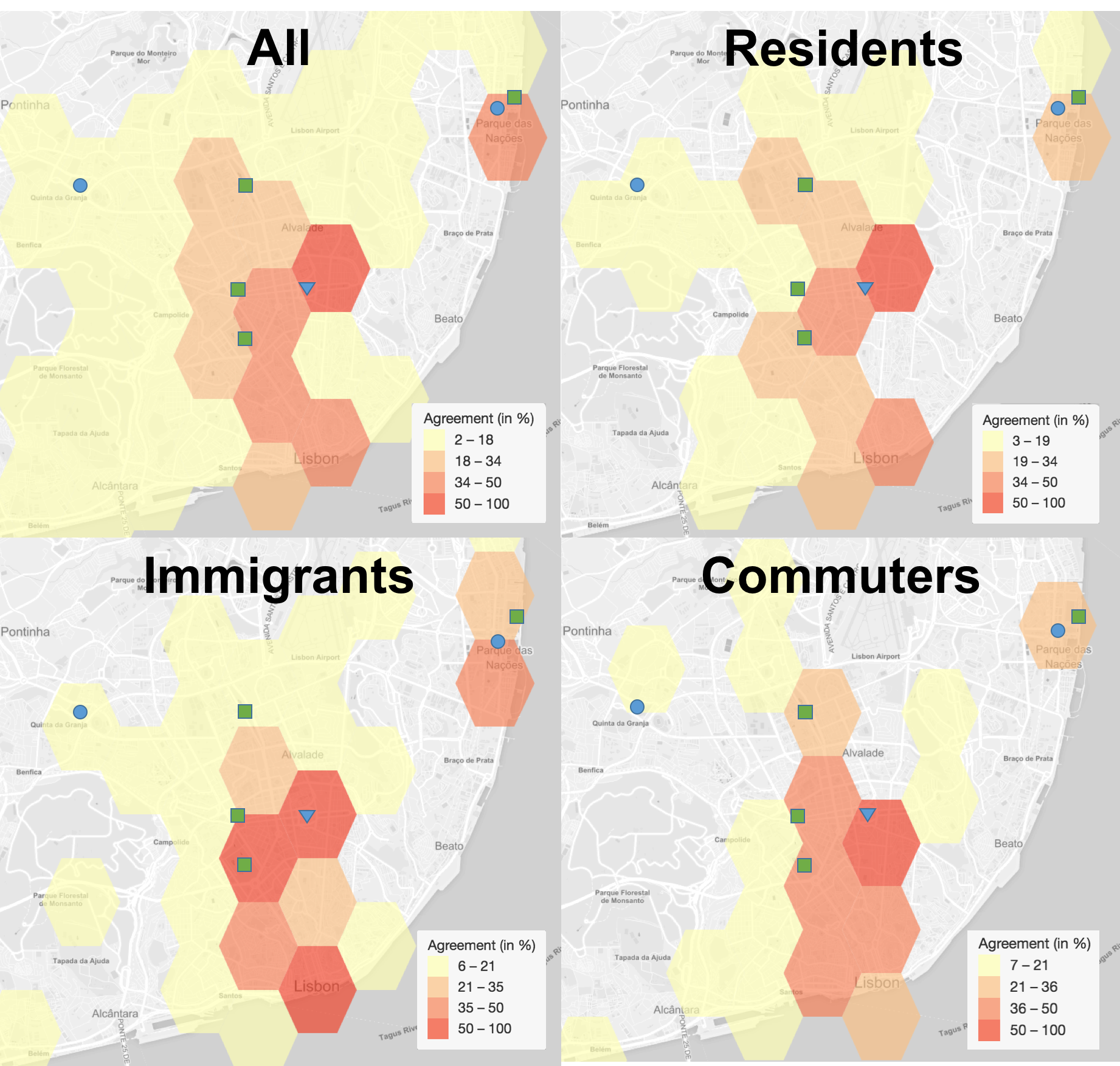
Comparison of the distribution of meaningful places accross different profiles. Green squares represent parks and other relevant public spaces, blue circles represent large malls, and the blue triangle is the college campus where a large part of the participants study. Yellow hexagons stand for a minimum of 3 participations that placed a marker inside them.
Considering the background of most of our participants, it's not surprising to see the area around the college campus as the most marked. Besides that, we can identify some more enlightening patterns. The most relevant is the "corridor" of darker hexagons connecting Lisbon's "Baixa", "Avenida da Liberdade", "Avenida Fontes Pereira de Melo", and "Alameda"/"Avenida de Roma". These can be easily pointed by anyone from Lisbon as the most generally frequented areas, or as the center of the city, due to the amount of offices, restaurants and "cafés", monuments, and overall accessibility by transport, which end up gathering residents, workers, students, and even tourist in the same area. Other than that, there's a curious, disconnected, darker area to the north-east, "Parque das Nações". It's a relatively modern area of the city, with big exterior spaces and leisure facilities, such as malls and bars, as well as many office spaces. While we suspected from the beginning that this would be one of the most marked zones in Lisbon, it still is quite interesting to see how important an area can be, even when this disconnected from the "important part of the city".
One can also see how some adjacent areas of the mentioned "central corridor" of darker hexagons, can have a drastically lower number of markers. It shows that it's possible to have no meaningful connections to a place so close to another so important.
More insights can be gathered from a filtered group of participations. Thanks to the filtering functionality of the Semantic Cities framework, we were able to process only the results for participants that identify as "Residents", "Immigrants", or "Commuters", ignoring other profiles for their very low number of participants.
When comparing the results, displayed in the above figure, we first get the feeling that there is no great differences among the placed markers, since all those 3 profiles maintain focus on the same central corridor. The major insights come, instead, from the lighter hexagons. They show how different Lisbon is for people living in the city ("residents" and "immigrants"), compared with that from commuters. Participants in this last group concentrate their meaningful places around a smaller area, mostly composed of business and leisure zones. They leave more residential, or less central areas unexplored. It's thus shown how commuters tend to deviate less from their usual routes and destinations, while people living in the city appear to explore more locations.
"My Lisbon"
One of the areas we asked participants to draw was "their Lisbon". With that we tried to target the part of the city they feel not only familiarized with, but also connected to: the area in Lisbon that is important to them.
From the start we suspected there would be a big similarity between the results of the previous step (meaningful places) and these. We were proven right as can be seen when comparing the previous figures with the one bellow.
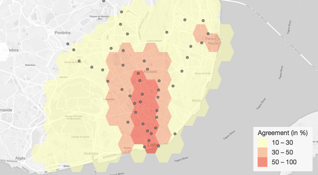
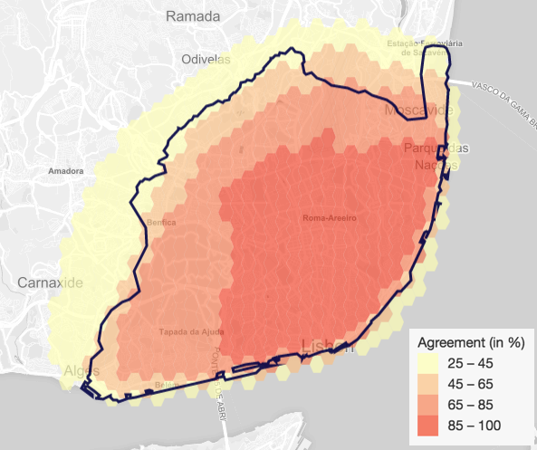
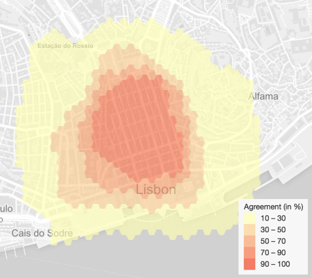
Agreement among "My Lisbon" drawings. Grey dots represent subway stations.
The previous map not only shows that the drawn areas are concentrated around the previously pointed meaningful places, but it also shows how the distribution of subway stations fit into the results. It's through those stations that we get the most interesting insights.
As we can see, where there is a greater concentration there is a greater agreement among drawings. This reveals that where there is greater accessibility through this type of public transport, which in turn is the most used among participants, there is a greater sense of familiarity and meaningfulness.
On the other hand, where there are no subway stations, there is a much lesser number of drawings. Thus, it also helps on proving the influence of public transports, this time by showing how a place, when not easily accessible, is more likely to be ignored by the general population.
For this set of results, it's also interesting to analyze how they differ among different profiles. We this in mind, we once again selected the "residents", "immigrants", and "commuters" among the participants, and produced a map for each of them, as the figures bellow show.
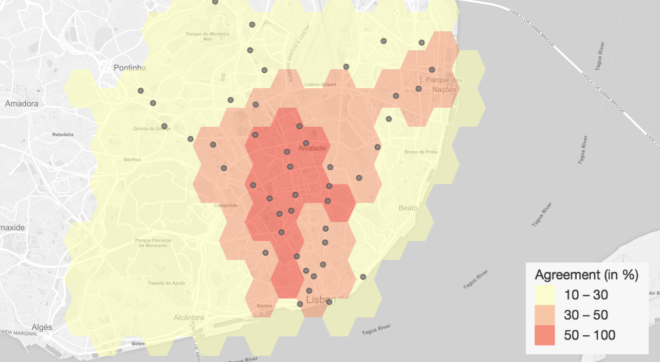
Agreement among "My Lisbon" drawings for "residents".
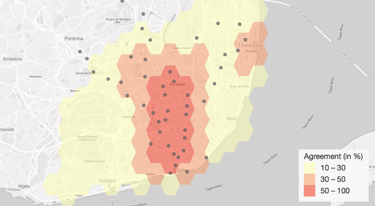
Agreement among "My Lisbon" drawings for "immigrants".
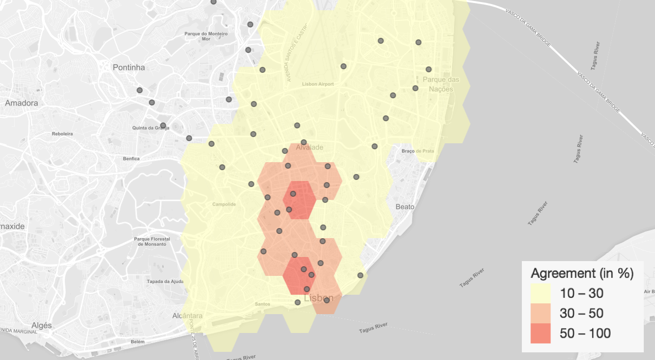
Agreement among "My Lisbon" drawings for "commuters".
Comparing with the general results, we can see that both "residents" and "immigrants", top left and top right, who by definition live inside Lisbon, had a greater tendency to expand their drawings. Take the residents' map, which expands towards north, a more exclusively residential area of the city.
For the case of "immigrants", we can see that there's the tendency to shift their drawings to the east, making sure to include one particular avenue, Avenida Almirante Reis. By considering that a great part of the participants study on the same college, we can relate this behavior with the fact that most people that come to Lisbon to study, end up living somewhere around that same avenue, in one of the several apartments made for students to rent.
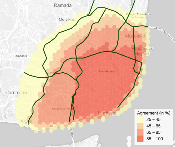
The most interesting case, however, comes from the results of commuters, on the bottom. We can see a clear tendency to draw much smaller areas. This means that most people within that profile feel familiar with a much smaller and central part of the city. This agrees with what most of us would expect, but is no less interesting to see it so clearly on top of the map.
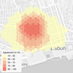
Official Area of Lisbon
By analyzing how people draw the official limits of Lisbon we can further understand how they perceive the city space. These limits can be seen on maps easily available to everyone, such as the subway network map.
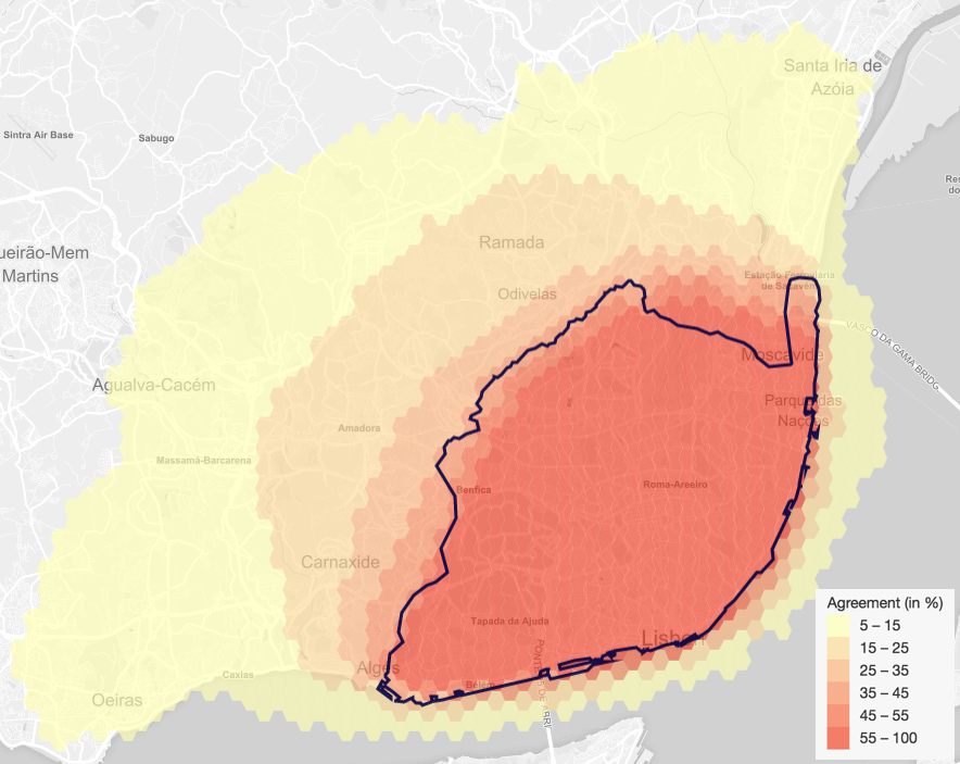
Observing the figure on the left, bellow, we can see that roughly half of the participants agreed on an area close to official one. However, approximately 15% of them drew a much smaller version of the city, in red, with particularly curious borders to the west and north. Those borders seem to fit almost perfectly into a ring of high speed roads, a rule only broken by the area around "Parque das Nações", as we can see in the figure on the right.
Agreement on the official area of Lisbon. The dark line, over the hexagons, represents the official limits of the municipality.
Agreement on the official area of Lisbon. The lines over the hexagons represents the different high speed roads in Lisbon.
Not only the smaller version of the drawings, but also the bigger, orange area seems to follow the rule. It takes another high speed road, on the north and east, and the bridge, on the north, as the general guidelines of where Lisbon ends.
We can trace back this behavior to previous work on the area of mental maps, that identified different city characteristics, such as hills and high speed roads, as main influence on one's mental map.
It is also worth noting that at least 5\% of participants considered Lisbon as being much bigger than it actually is, including surrounding cities and suburban areas as part of it, see figure bellow, and given that we set limits to the map's panning, it is safe to say there could have been even bigger drawings. We suspected that among these participants would probably be the ones who placed their living area outside of Lisbon but, at the same time, stated they live in it. However, after we exported the results relating distance between living place and area, and relative size of the drawn area, we found no correlation between those who were living outside of Lisbon and the size of the areas they drew. In fact, of the 20 people that drew an area at least 20% bigger than the official, only 8 lived outside the official boundaries.
In order to better quantify the perception of the participants, we found the agreement between each one's drawn area and the official area of Lisbon, plotting them into a box plot graph, see figure bellow on the left. As you can see indicated by the blue dot inside the box, the mean agreement was around 70% of the area, and although there were some low values, more than 75% of them were above the 60% agreement mark, while 50% of participations exceeded 80% of agreement with the official area. Furthermore, there were 8 participations with close to, or exactly, 100% of agreement, something that reminded us that it would be easy to reach full agreement if the drawn area contained all of the official area, and looking at the previous figure, we know that some people did exactly that. To tackle this, we also box-plotted the ratio between the size of the two areas (drawn area relative to the official), and it shows that more than 50% of participants drew an area greater than the official one, as the above map pointed to. This data points to the general tendency of over-sizing the area of Lisbon, thus revealing one more type of inaccuracy to account for.
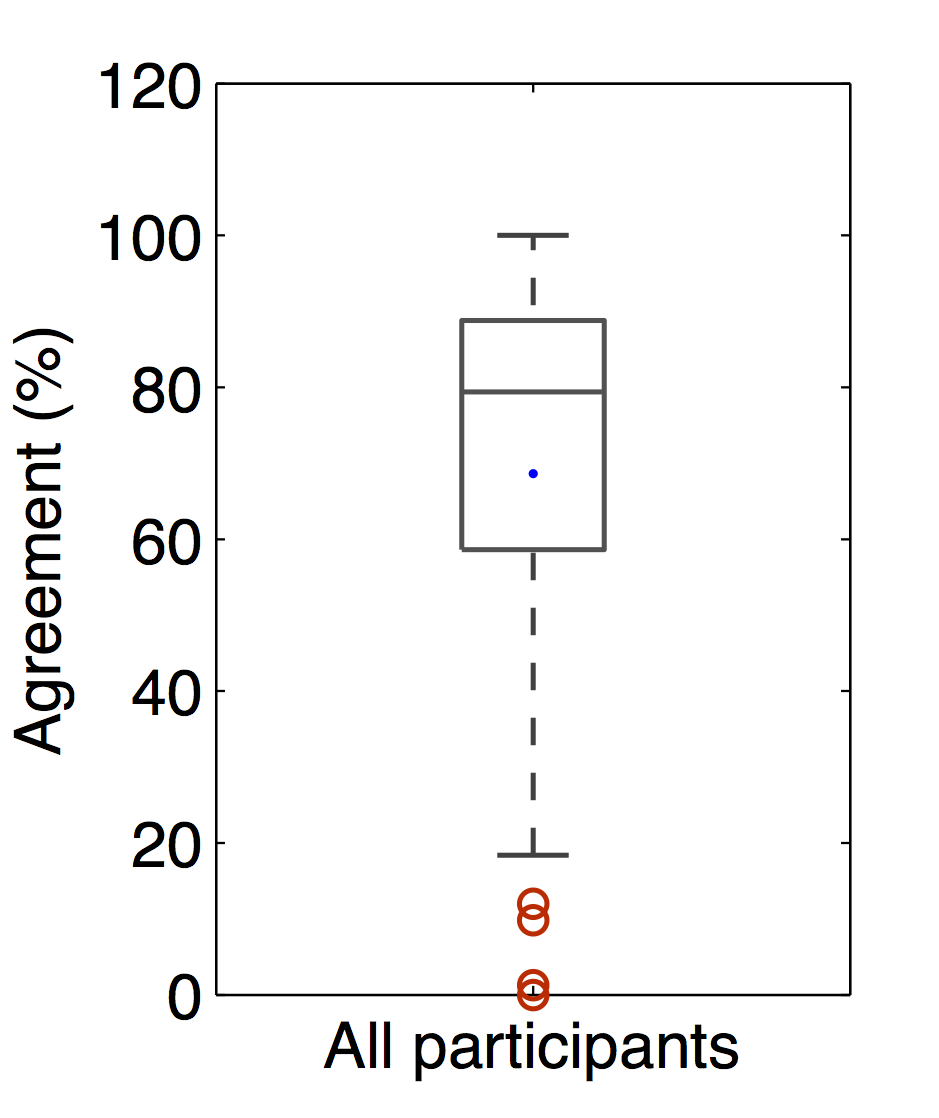
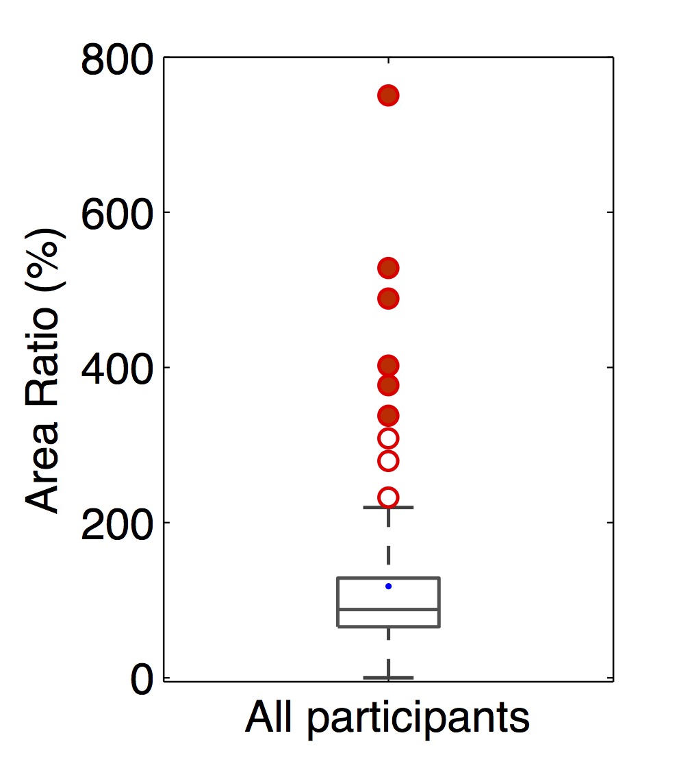
Boxplot of the agreement between drawings for "official Lisbon" and the actual official area (left) and the area of the drawings for "official Lisbon", relative to the official (right).
We previously saw that the most meaningful places seem to be influenced by the kind of relation one has with the city. It's thus natural to check if the same applies to how a person perceives space, and in this case, the boundaries of the city. For this step, we identified two general groups: the ones living in Lisbon, which include both "residents" and "immigrants"; and the ones only working or studying in Lisbon, the same "commuters" as before. To analyze the results, we again resorted to box plots, see figures bellow. As we can see by the graph that addresses the agreement for both groups, on the left, and as expected, people living in Lisbon seem to be more correct overall, when comparing to the commuters, even considering some outliers. However, as we look into the size of the area participants drew, on the right, we notice that people living in Lisbon drew, in general, much bigger areas than commuters, averaging around 120% against 80%. This plays in favor of residents and immigrants, since that with such big drawings, it's much less likely to miss. The interesting point, though, is the difference in behavior among these two groups, since commuters tended to under-size the area of Lisbon, while residents and immigrants did the opposite. We suspect that such behavior derives from where each of the participants live. A person who lives on the surroundings of the city area, and is aware of living outside of it, passing through the city borders twice a day most of the days, probably has a better understanding of where the actual city of Lisbon begins, while the individual who lives in Lisbon, more easily has a less defined notion of where the city ends and adjacent cities begin.
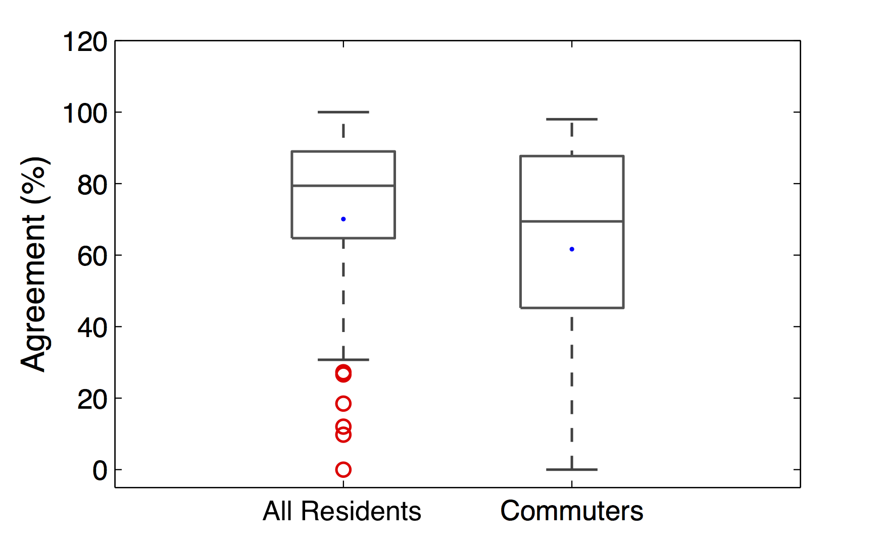
Boxplot of the agreement between drawings for "official Lisbon" and the actual official area, comparing people living in Lisbon with people only working in Lisbon.
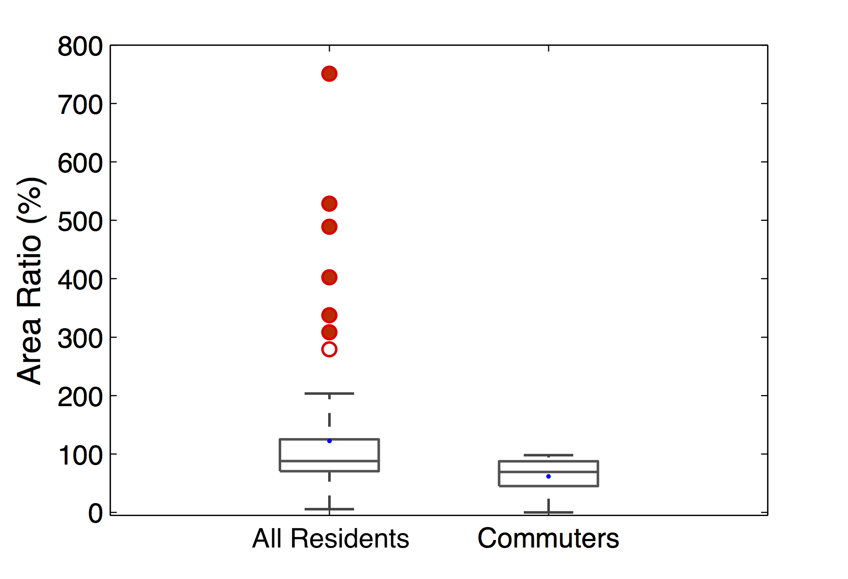
Boxplot of the area of the drawings for "official Lisbon", relative to the official, comparing people living in Lisbon with people only working in Lisbon.
Finally, and as pointed by several studies in the topic, the type of transport people use can have a major impact on their mental map, which led us to test it on our results. As we asked every participant for the types of transport they used most to get around, we needed only to split them by the answers to that question.
We formed several groups: one for car users, another for public transport users, another for "walkers", and a last one for "non-walkers". The results, however, reveal no large enough difference to be pointed, which goes against most of previous work in this area. We blame this to the fact that both public transports and walking are too short-ranged to influence the perception of such a large area. Besides, the studies we analyzed didn't address the influence on boundary perception, but rather referenced the type of transport as influence to how one sees the closeness between two points, or to how one perceives the surrounding area to a station compared to one further away from it, etc. We thus take away the conclusion that for such large areas, and in what regards boundaries perception, the type of transport people regularly use does not have a significant influence in their mental map.
Lisbon Neighborhoods
By creating the last step for neighborhoods drawing, even though we don't end up with a mental map of the city, we can observe the formation of a mental map through the results for areas which aren't officially defined or bounded, also finding inaccuracies in those who are. Hence, considering there were 48 neighborhoods to choose from, we decided to only focus on neighborhoods that showed interesting results and fulfilled at least one of these points: they have no official area; they share their name with a subway station; they have official boundaries but results show a great discrepancy, or interesting agreement; they especially address a certain sub-group of participants (e.g. areas with bars for young people).
Non-bounded areas
For this city in particular, non-bounded areas make quite an interesting case. In Lisbon's historical center, several zones can be identified by anyone familiar with the city, such as Baixa, Chiado, and Rossio. However, even considering their popularity and history, they are not officially bounded, and can differ completely in each person's mind. As we can see from the figure bellow, on the left, the results concerning the area of Baixa show a general consensus around a particular group of blocks, characterized by planned streets and typical architecture, called Baixa Pombalina. However, as that area ends, so does the consensus. Anyone from Lisbon will find it curious that only half of the participants included Terreiro do Paço on their drawings, a square that was built along with the rest of Baixa Pombalina. Other than that, it's also interesting to note the western part of the area, that divided most participants, was included in its most part in the drawings for yet another area, Chiado, pictured bellow on the right. It goes to show just how interesting the results for these two neighborhoods are, since each is recognized as a unique area in its own right, but at the same time viewed as being part of the other.
Agreement among drawings for the area of Baixa.
Agreement among drawings for the area of Chiado.
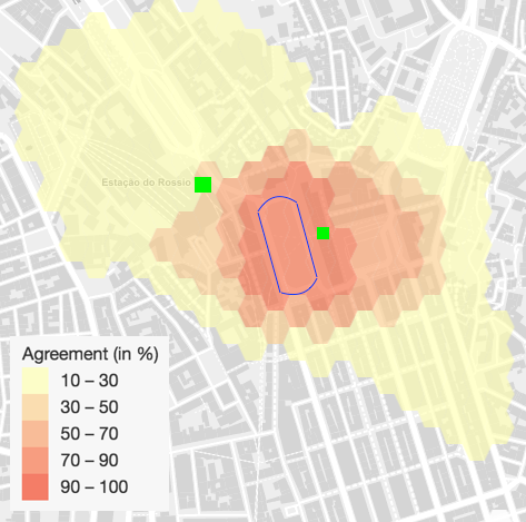
Another interesting case is Rossio, with the results pictured bellow. This place is usually associated with a specific square, officially named Praça Dom Pedro IV, but Rossio is such a popular name that it was the one chosen for both the train and subway stations nearby. But how big is Rossio? As the figure shows, there is a clear concentration of drawings around the square, represented with the blue line. However, the adjacent plaza to the east, Praça da Figueira, draws at least 50% of agreement, and although we can't say for sure, we suspect that the subway station (eastern green square) influenced those decisions. The same phenomenon seems to apply to the train station (northern green square), and its adjacent patio to the south. These results prove how important the combination of public, open spaces, with important transit hubs, can influence the mental map of a population.
Agreement among drawings for the area of Rossio.
Officially-bounded areas
The previous set of neighborhoods reveals how the population's perception can vary when confronted with non-bounded areas. They find their own, personal boundaries, be it changes in architecture, or street planning, for the Baixa/Chiado areas, or the limits of an open and public space, for Rossio. Considering how different each one's opinion and thoughts can be, it's quite interesting to find close to general agreement on some borders. But what if we compare mental maps with official boundaries? Did authorities make a good job on defining administrative areas according to how people imagine them to be? We target just that by comparing what people drew for an area with the same name of official administrative districts.
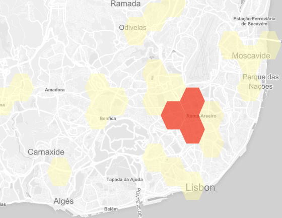
In the figures bellow, we can see four different parishes, or "freguesias", with their boundaries laid out on top of the results. These were among the most drawn areas, and represent a good overview over most possible cases. The top left picture shows the parish of Alvalade and how participants perceive its area. We can see a clear agreement over what it's known as the neighborhood of Alvalade, a mostly residential urbanization project from the middle of the 20th century. While the darkest shades avoid some parts of the said urbanization, the following lighter, orange shades fill the rest of it, forming an almost perfect square on the map. Furthermore, the greatest discussion regards the eastern borders where each shade covers more area. Regardless of how we consider the results, though, it's clear that the official parish is of much greater area than what was drawn, reaching zones for which is safe to say no participant would feel in Alvalade. The same seems to happen with Arroios, bottom left, where there is a much greater space, relatively speaking, left blank. As we can see, most drawings are concentrated around the exits of the subway station with the same name, green squares on the map, forming a circle with little disagreement on the surrounding area.
Agreement among drawings for the area of Alvalade.
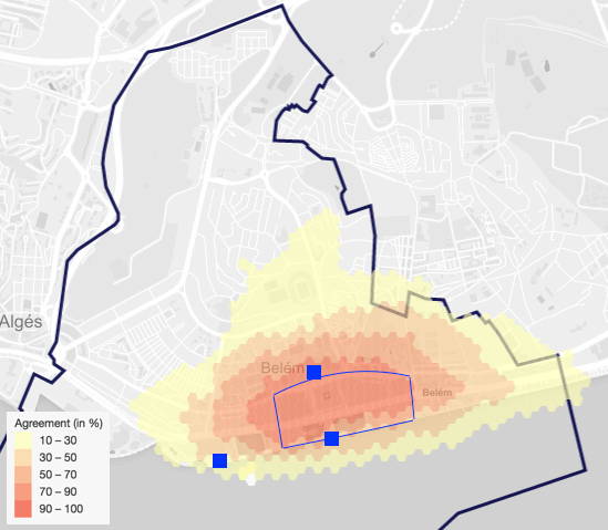
Agreement among drawings for the area of Belém.
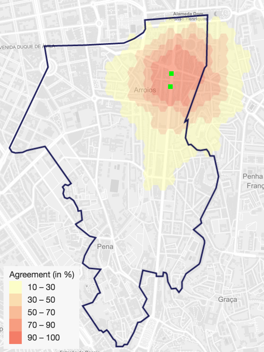
Agreement among drawings for the area of Arroios.

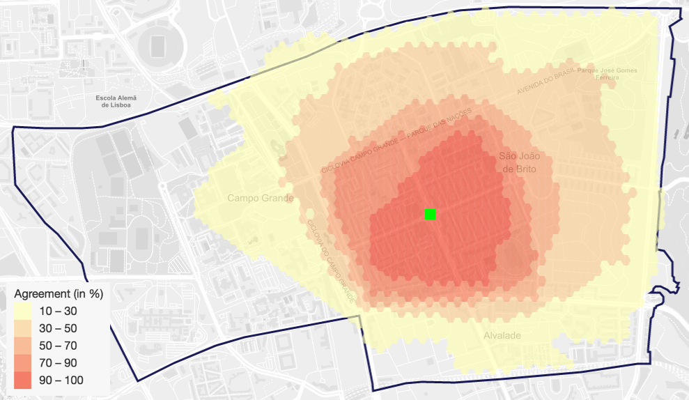
Agreement among drawings for the area of Parque das Nações.
Parque das Nações, bottom-left, is probably where the drawings are more close to the official area. Participants included most of the riverside walk and park, and seemed only to disagree over where it ended. The majority reached the latitude of Moscavide, another neighborhood, and stopped drawing there, while others continued until they had reached Vasco da Gama bridge. What's interesting is that none of them continued past that bridge, even though the same park continues past it, showing how participants probably take the bridge as a border for the parish, or even for the city.
Belém, top right, follows the pattern of the first two described neighborhoods in this section, where participants left a great area of the district untouched. This area is internationally known for its riverside monuments (marked with blue squares on the map), its museums, and, for locals, various public parks and gardens (delimited with the thin blue line on the map). It's clear that the general orientation was based on exactly those points, since the area of most agreement matches the gardens and surrounding museums. There seems to be not much discussion over how north that area goes, and rather the disagreement is most found longitudinally for both west and east. Regardless, participants stayed away from the northern part of the parish, where the old and small buildings, and large monuments, give place to, mostly, single family residences for the higher class.
Once again, this points to the same group of influences to someone's mental map: public transportation habits; physical barriers such as larger and busier streets or bridges; public spaces and monuments; or drastic change in architecture.
Areas by subgroups of people
In order to find even more influencing factors, we wanted to find out how the drawings vary with each person's characteristics. On our case study there are some areas that show just that: some that are almost exclusively known for a type of activity, others characterized by their touristic appraisal, and other known only as residential neighborhoods.
Bairro Alto is mostly known for its nightlife, and the way it attracts mostly young people to its many bars every week. Based on that fame, we analyzed the differences in perception between younger people, under 25 years, and older people. The results share a basic core, as you can see bellow, but other than that, they are quite different. By following the orange extent, we notice that older participants, on the right spread their drawings much more than the younger participants, following no clear boundaries. It is important to note that younger participants, in addition to use busier and wider streets as borders, concentrated their drawings over a more bar-filled area, while the older group reached for more touristic places, and shopping areas. This makes it clear of how influenced someone's mental map can be by the use that same person gives to a space.
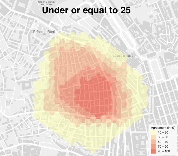
Agreement among drawings for the area of Bairro Alto, by people with 25 or younger.
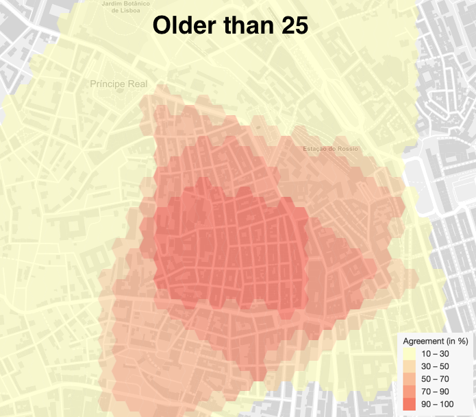
Agreement among drawings for the area of Bairro Alto, by people older than 25.
Another great case study for this kind of analysis is Arco do Cego, an area near the college most participants are from. While there is a whole, clearly delimited neighborhood with that name, there is also a park with the same name where lots of college students gather to have a drink after classes. It's thus obvious the choice to split the participants into two groups, one representing students from the nearby college, and another for the rest of participants. We achieved this by filtering participations that placed a "meaningful place" marker inside the college campus, probably reaching most of the targeted group.
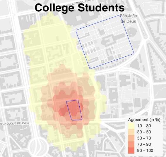
Agreement among drawings for the area of Arco do Cego, by people studying in the nearby college.
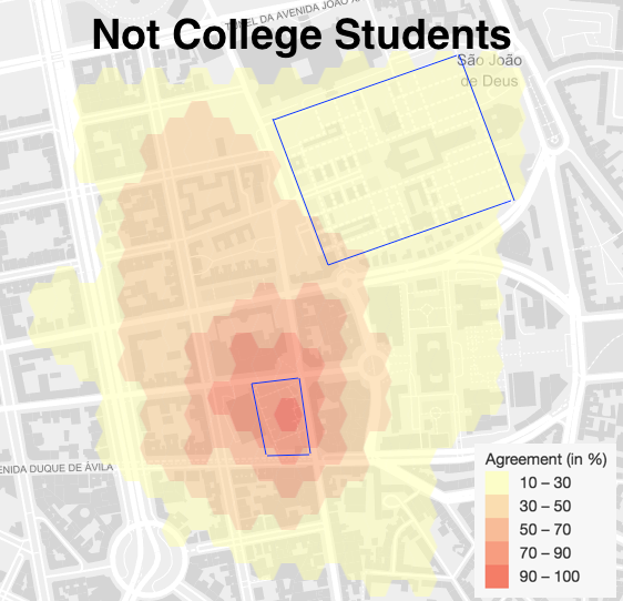
Agreement among drawings for the area of Bairro Alto, by people that don't study in the nearby college.
As we can see from the results, above on the left, college students' drawings concentrate more around the park, blue delimited area to the south, a zone with which they are probably quite familiar, while a greater number of non-college students, on the right, tended to include surrounding areas, as we can see from a greater orange shaded area, and some even took the care to consider the neighborhood that takes the same name, in blue at the north-eastern end of the map.
There are two things to point out, then: how most people ignored the neighborhood, and the influence of familiarity with the space. They thus show us how surprising a mental map can be, ignoring places that would be normal to include in official maps as part of some delimitation, and how familiarity is taken into account, rather than a name.
Conclusions
We conclude our study by, first of all, pointing how unfortunate it was for not collecting more diversified answers, notably the lack of tourists, a group that could have had so much more insights. Nevertheless, we were able still to testify on the first-hand the power of habits, age, or just simply life itself, in regards to how they can shape one's spatial orientation and image.
Not only was the Semantic Cities Framework able to prove the findings of many previous projects on the subject of mental maps, thanks to it we could actually see how such maps were formed and shaped. It was possible to freely explore the influences behind each drawing, and compare visually and statistically the results from any group that we saw fit.
We are confident that the framework used in this study will provide many more interesting findings related to a number of cities, and on the topic of mental maps itself.