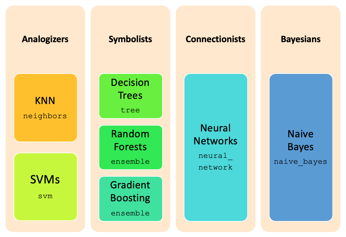
Classification
Classification is one of the major tasks in data science, and can be performed through sklearn package
and its multiple subpackages. The image below summarizes the different major classification techniques and the
corresponding implementation packages in sklearn.
The classification task occurs in three steps:
- first, we learn several models, by training them over a labeled dataset, called the train dataset;
- second, we evaluate the different models over a independent dataset - the test dataset, predicting the target variable for each of its records, and comparing them with the real ones;
- thirdly, we choose the model showing the best performance, and use it for predicting the target value for unseen records.
Training Strategies
Whenever we are in the presence of a classification problem, the first thing to do is to identify the target or class, which is the variable to predict. The type of the target variable determines the kind of operation to perform: targets with just a few values allow for a classification task, while real-valued targets require a prediction one.
In the presence of a classification task, identifying the target balancing is mandatory, in order to choose the most adequate balancing strategy (see Data balancing) and elect the best metrics to evaluate the results achieved.
After applying balancing techniques, if required, the next thing to proceed with the training step, is to choose the best training strategy to apply. This strategy concerns with the way to get the train and test datasets, which is done in accordance to the dataset size:
k-fold cross validation (
StratifiedKFold): used in the presence of a few thousand records;hold-out (
train_test_split): used in the presence of a few thousands of records;sample hold-out: used in the presence of large thousands of records.
Remark: in each one of the strategies is important to note, that the split can't be completely random, but should
keep the original distribution of the target variable. More, all the variables distribution should be kept for each
data subset, which usually is achieved through a stratify parameter.
train_test_split function
As noted above, the train of classification models is achieved through sklearn package. Since it is
constructed over the numpy package, we need to present numpy arrays ndarray as parameters
for the different methods, like train_test_split.
In mathematical terms, classification aims to map the data X to values into the domain of the target variable, call it y.
After loading the data, in data dataframe, we need to separate the target variable from the rest of the data,
since it plays a different role in the training procedure. Through the application of the pop method, we
get the class variable, and simultaneously removing it from the dataframe. So, y will keep the
ndarray with the target variable for each record and X the ndarray containing the
records themselves.
from numpy import array, ndarray
from pandas import read_csv, DataFrame

file_tag = "stroke"
index_col = "id"
target = "stroke"
data: DataFrame = read_csv("data/stroke_mvi_encoded.csv", index_col=index_col)
labels: list = list(data[target].unique())
labels.sort()
print(f"Labels={labels}")

positive: int = 1
negative: int = 0
values: dict[str, list[int]] = {
    "Original": [
        len(data[data[target] == negative]),
        len(data[data[target] == positive]),
    ]
}

y: array = data.pop(target).to_list()
X: ndarray = data.values
Labels=[0, 1]
Be careful, when you do not transform the class values to a numeric format, sklearn faces the first value encountered in the data as 0, which results in a very poor correspondence, since it may change per dataset. And the evaluation metrics become inconsistent.
For this reason we should encode the class variable to a numeric format, to avoid all these inconsistences.
From the chart plotted, we realize that the number of people with a stroke 1 is around fiver percent of the number of
people without strokes, 0 records, making it deeplly unbalanced. And that this distribution was kept unchanged for
our train and test datasets... and in order to make it easier for the training we should balance the data.
from pandas import concat
from matplotlib.pyplot import figure, show
from sklearn.model_selection import train_test_split
from dslabs_functions import plot_multibar_chart


trnX, tstX, trnY, tstY = train_test_split(X, y, train_size=0.7, stratify=y)

train: DataFrame = concat(
    [DataFrame(trnX, columns=data.columns), DataFrame(trnY, columns=[target])], axis=1
)
train.to_csv(f"data/{file_tag}_train.csv", index=False)

test: DataFrame = concat(
    [DataFrame(tstX, columns=data.columns), DataFrame(tstY, columns=[target])], axis=1
)
test.to_csv(f"data/{file_tag}_test.csv", index=False)

values["Train"] = [
    len(train[train[target] == negative]),
    len(train[train[target] == positive]),
]
values["Test"] = [
    len(test[test[target] == negative]),
    len(test[test[target] == positive]),
]

figure(figsize=(6, 4))
plot_multibar_chart(labels, values, title="Data distribution per dataset")
show()

The code above applies a hold-out split, through the train_test_split, which receives both X and
y as the data to split, and returns both of them split in two: trnX will contain trains_size of X and tstX will contain the remaining 30%, and the same for y.
Reading Train and Test datasets
Another useful function is one that reads both the train and test datasets from files, that we implement through the read_train_test_from_files below.
from pandas import read_csv


def read_train_test_from_files(
    train_fn: str, test_fn: str, target: str = "class"
) -> tuple[ndarray, ndarray, array, array, list, list]:
    train: DataFrame = read_csv(train_fn, index_col=None)
    labels: list = list(train[target].unique())
    labels.sort()
    trnY: array = train.pop(target).to_list()
    trnX: ndarray = train.values

    test: DataFrame = read_csv(test_fn, index_col=None)
    tstY: array = test.pop(target).to_list()
    tstX: ndarray = test.values
    return trnX, tstX, trnY, tstY, labels, train.columns.to_list()


file_tag = "stroke"
train_filename = "data/stroke_train_smote.csv"
test_filename = "data/stroke_test.csv"
target = "stroke"
eval_metric = "accuracy"

trnX: ndarray
tstX: ndarray
trnY: array
tstY: array
labels: list
vars: list
trnX, tstX, trnY, tstY, labels, vars = read_train_test_from_files(
    train_filename, test_filename, target
)
print(f"Train#={len(trnX)} Test#={len(tstX)}")
print(f"Labels={labels}")
Train#=6806 Test#=1533
Labels=[0, 1]
Estimators and Models
With the data split, we proceed to create the prediction model. However, there is a plethora of techniques and extensions, with an infinite number of different parametrisations, and the choice of the best one to apply can only be done by comparing their results in our data. Additionally, each technique works better for data with some specific characteristics, which demands the application of some data preparation transformations.
In the sklearn package, an estimator is an object of an extension of the BaseEstimator class, which implements the fit and predict methods. Beside these, it also implements the score method. Estimators parametrization are done through passing the different choices as parameters to their constructors methods.
Note that in sklearn there is no abstract class for representing the models learnt, but their effects are reachable through the estimator object. Indeed, an estimator is the result of parametrising a learning technique, trained over a particular dataset, creating a classification model.
Estimators Methods |
|---|
|
trains the classifier over the data trnX labeled according to trnY, creating an internal model |
|
applies the learnt model to the training data in trnX and returns their predicted labels |
|
applies the model to tstX and compares the predicted labels to the labels in tstY, computing model's mean accuracy on the given data |
Next, we illustrate the use of these methods with the simplest estimator provided - the Gaussian Naive Bayes.
from sklearn.naive_bayes import GaussianNB

clf = GaussianNB()
clf.fit(trnX, trnY)
pred_trnY: array = clf.predict(trnX)
print(f"Score over Train: {clf.score(trnX, trnY):.3f}")
print(f"Score over Test: {clf.score(tstX, tstY):.3f}")
Score over Train: 0.772
Score over Test: 0.702
Evaluation
The evaluation of the results of each learnt model, in the classification paradigm, is objective and straightforward. We just need to assess if the predicted labels are correct, which is done by measuring the number of records where the predicted label is equal to the known ones.
Accuracy, Recall and Precision
The simplest measure is accuracy, which reports the percentage of correct predictions. It is just the
opposite of error. the score method from each classifier, after its training and measured over a particular dataset and its known labels.
As we saw, by training the estimator we are able to see its mean accuracy by using the score method. However, it's not practical to predict the labels whenever we need to analyse the models performance. To address this, sklearn provides an additional package - the sklearn.metrics, that makes available a set of evaluation measures.
In this package, accuracy is reported through the accuracy_score method, which also provides recall and precision, through recall_score and precision_score respectively, allowing for the analysis of the impact of the different types of errors.
from sklearn.metrics import accuracy_score, recall_score, precision_score

pred_tstY: array = clf.predict(tstX)

acc: float = accuracy_score(tstY, pred_tstY)
recall: float = recall_score(tstY, pred_tstY)
prec: float = precision_score(tstY, pred_tstY)
print(f"accuracy={acc:.3f} recall={recall:.3f} precision={prec:.3f}")
accuracy=0.702 recall=0.827 precision=0.123
In our example, the results are not extraordinary, reching around 70% of accuracy, 81% of recall but only 12% of precision.
Besides these three, there are several other measures that try to reflect the quality of the model, also
available in the sklearn.metrics package. Next, we summarize the most used.
Classification metrics |
|---|
|
also called sensitivity> and TP rate, reveals the models ability to
recognize the positive records, and is given by |
|
reveals the models ability to not misclassify negative records, and is given by
|
|
computes the average between precision and recall, and is given by
|
|
reveals the average of recall scores for all the classes; receives the known labels in tstY and the predicted ones in prdY |
Confusion Matrix
Despite the usefulness of those metrics, they all derive from the number of errors made by our classifier, that can be of two different kinds. In the presence of binary classification problems (there are only two possible outcomes for the target variable), this distinction is easy. Usually, we call negative to the most common target value and positive to the other one.
From this, we have:
- true positives (TP): the number of positive records rightly predicted as positve;
- true negatives (TN): the number of negatives records rightly predicted as negative;
- false positives (FP): the number of negative records wrongly predicted as positve;
- false negatives (FN): the number of positive records wrongly predicted as negative.
The confusion matrix is the standard to present these numbers, and is computed through the
confusion matrix in the sklearn.metrics package.
from pandas import unique
from sklearn.metrics import confusion_matrix

labels: list = list(unique(tstY))
labels.sort()

prdY: array = clf.predict(tstX)
cnf_mtx_tst: ndarray = confusion_matrix(tstY, prdY, labels=labels)
print(cnf_mtx_tst)
[[1014  444]
 [  13   62]]
Unfortunately, we are not able to see the correspondence between the matrix elements and the enumerated above, since there is no standard to specify the row and columns in the matrix. So the best way is to plot it in a specialized chart, as the one below.
from itertools import product
from numpy import ndarray, set_printoptions, arange
from matplotlib.pyplot import gca, cm
from matplotlib.axes import Axes


def plot_confusion_matrix(cnf_matrix: ndarray, classes_names: ndarray, ax: Axes = None) -> Axes:  # type: ignore
    if ax is None:
        ax = gca()
    title = "Confusion matrix"
    set_printoptions(precision=2)
    tick_marks: ndarray = arange(0, len(classes_names), 1)
    ax.set_title(title)
    ax.set_ylabel("True label")
    ax.set_xlabel("Predicted label")
    ax.set_xticks(tick_marks)
    ax.set_yticks(tick_marks)
    ax.set_xticklabels(classes_names)
    ax.set_yticklabels(classes_names)
    ax.imshow(cnf_matrix, interpolation="nearest", cmap=cm.Blues)

    for i, j in product(range(cnf_matrix.shape[0]), range(cnf_matrix.shape[1])):
        ax.text(
            j, i, format(cnf_matrix[i, j], "d"), color="y", horizontalalignment="center"
        )
    return ax


figure()
plot_confusion_matrix(cnf_mtx_tst, labels)
show()

ROC Charts
ROC charts are another mean to understand models' performance, in particular in the presence of binary non balanced datasets.
They present the balance between True Positive rate (recall) and False Positive rate in a graphical way, and are
available through the RocCurveDisplay method in sklearn.metrics.
from sklearn.metrics import RocCurveDisplay
from config import ACTIVE_COLORS


def plot_roc_chart(tstY: ndarray, predictions: dict, ax: Axes = None, target: str = "class") -> Axes:  # type: ignore
    if ax is None:
        ax = gca()
    ax.set_xlim(0.0, 1.0)
    ax.set_ylim(0.0, 1.0)
    ax.set_xlabel("FP rate")
    ax.set_ylabel("TP rate")
    ax.set_title("ROC chart for %s" % target)

    ax.plot(
        [0, 1],
        [0, 1],
        color="navy",
        label="random",
        linewidth=1,
        linestyle="--",
        marker="",
    )
    models = list(predictions.keys())
    for i in range(len(models)):
        RocCurveDisplay.from_predictions(
            y_true=tstY,
            y_pred=predictions[models[i]],
            name=models[i],
            ax=ax,
            color=ACTIVE_COLORS[i],
            linewidth=1,
        )
    ax.legend(loc="lower right", fontsize="xx-small")
    return ax


figure()
plot_roc_chart(tstY, {"GaussianNB": prdY}, target=target)
show()

In addition to the chart, the area under the roc curve, auc for short, is another important measure, mostly for unbalanced datasets. It is available as roc_auc_score, in the sklearn.metric package, and receives the known labels in its first parameter and the predicted labels as the second one.
In order to make it easier to analyse the performance of a given model, we can make use of a function that combines all those elements. We implement it through plot_evaluation_results function, that receives as its first parameter a descritpion of the model to evaluate. This description consists of a dictionary, where the keys name, metric and params have to be present. While name identifies the classifier trained, metric concerns to the metric used to select the model and params stores the parameters used to train the model.
from typing import Callable
from matplotlib.figure import Figure
from matplotlib.pyplot import subplots, savefig, figure
from sklearn.metrics import roc_auc_score, f1_score
from dslabs_functions import plot_multibar_chart, HEIGHT

CLASS_EVAL_METRICS: dict[str, Callable] = {
    "accuracy": accuracy_score,
    "recall": recall_score,
    "precision": precision_score,
    "auc": roc_auc_score,
    "f1": f1_score,
}


def plot_evaluation_results(
    model, trn_y, prd_trn, tst_y, prd_tst, labels: ndarray
) -> ndarray:
    evaluation: dict = {}
    for key in CLASS_EVAL_METRICS:
        evaluation[key] = [
            CLASS_EVAL_METRICS[key](trn_y, prd_trn),
            CLASS_EVAL_METRICS[key](tst_y, prd_tst),
        ]

    params_st: str = "" if () == model["params"] else str(model["params"])
    fig: Figure
    axs: ndarray
    fig, axs = subplots(1, 2, figsize=(2 * HEIGHT, HEIGHT))
    fig.suptitle(f'Best {model["metric"]} for {model["name"]} {params_st}')
    plot_multibar_chart(["Train", "Test"], evaluation, ax=axs[0], percentage=True)

    cnf_mtx_tst: ndarray = confusion_matrix(tst_y, prd_tst, labels=labels)
    plot_confusion_matrix(cnf_mtx_tst, labels, ax=axs[1])
    return axs


model_description: dict = {"name": "GaussianNB", "metric": eval_metric, "params": ()}

prd_trn: array = clf.predict(trnX)
prd_tst: array = clf.predict(tstX)
figure()
plot_evaluation_results(model_description, trnY, prd_trn, tstY, prd_tst, labels)
savefig(
    f'images/{file_tag}_{model_description["name"]}_best_{model_description["metric"]}_eval.png'
)

show()
<Figure size 600x450 with 0 Axes>

Among the techniques that we are going to use, are: GaussianNB, KNeighborsClassifier, DecisionTreeClassifier, RandomForestClassifier, GradientBoostingClassifier and MultiLayerPerceptron.
The rest of this module is organized in a similar way for each one of the classification techniques: it first succinctly describes the technique and its main parameters, then we train different models through different parametrisations of the technique, using a 70%train-30%test split strategy, and evaluate the accuracy of each model as explained, comparing the different results.