|
|
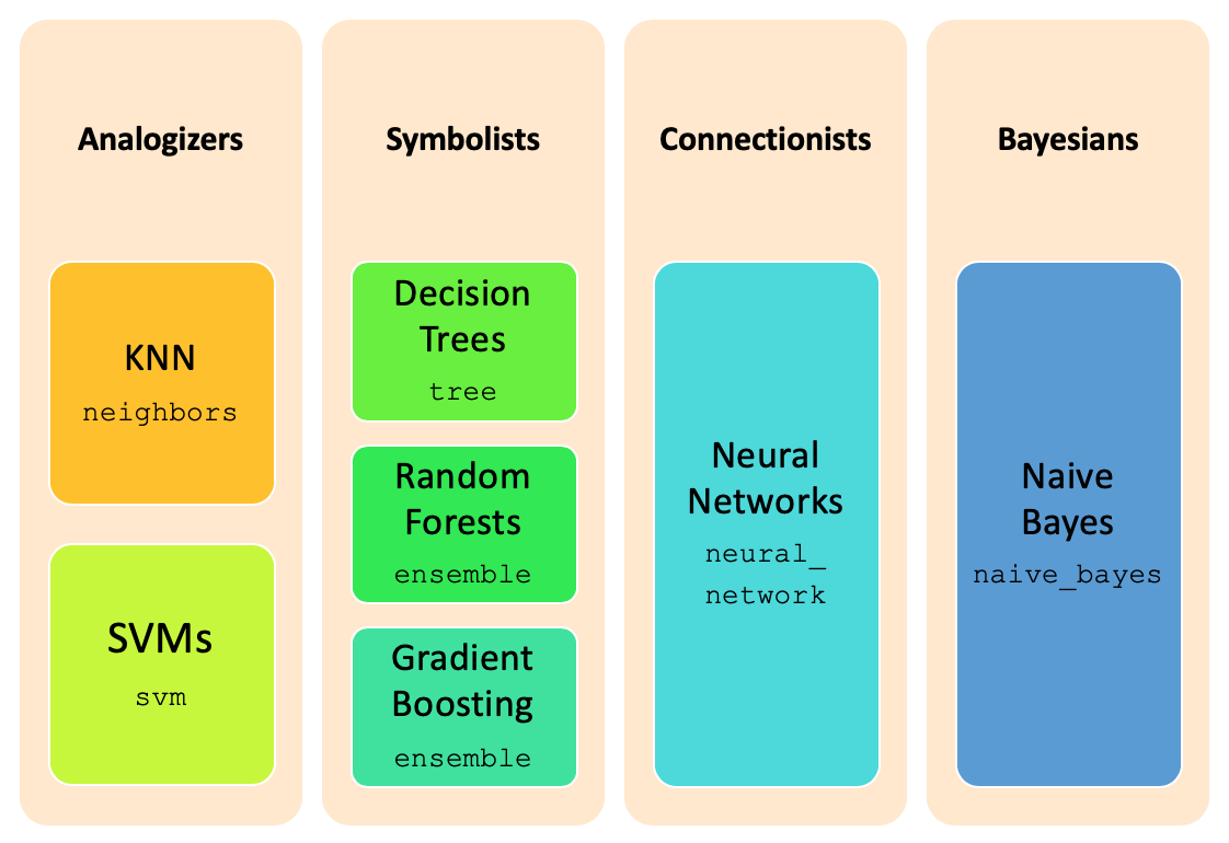
Classification is one of the major tasks in data science, and can be performed through sklearn package
and its multiple subpackages. The image below summarizes the different major classification techniques and the
corresponding implementation packages in sklearn.
The classification task occurs in three steps:
Whenever we are in the presence of a classification problem, the first thing to do is to identify the target or class, which is the variable to predict. The type of the target variable determines the kind of operation to perform: targets with just a few values allow for a classification task, while real-valued targets require a prediction one.
In the presence of a classification task, identifying the target balancing is mandatory, in order to choose the most adequate balancing strategy (see Data balancing) and elect the best metrics to evaluate the results achieved.
After applying balancing techniques, if required, the next thing to proceed with the training step, is to choose the best training strategy to apply. This strategy concerns with the way to get the train and test datasets, which is done in accordance to the dataset size:
k-fold cross validation (StratifiedKFold): used in the presence of a few thousand records;
hold-out (train_test_split): used in the presence of a few thousands of records;
sample hold-out: used in the presence of large thousands of records.
Remark: in each one of the strategies is important to note, that the split can't be completely random, but should
keep the original distribution of the target variable. More, all the variables distribution should be kept for each
data subset, which usually is achieved through a stratify parameter.
As noted above, the train of classification models is achieved through sklearn package. Since it is
constructed over the numpy package, we need to present numpy arrays ndarray as parameters
for the different methods, like train_test_split.
In mathematical terms, classification aims to map the data X to values into the domain of the target variable, call it y.
After loading the data, in data dataframe, we need to separate the target variable from the rest of the data,
since it plays a different role in the training procedure. Through the application of the pop method, we
get the class variable, and simultaneously removing it from the dataframe. So, y will keep the
ndarray with the target variable for each record and X the ndarray containing the
records themselves.
import numpy as np
from pandas import read_csv, concat, unique, DataFrame
import matplotlib.pyplot as plt
import ds_charts as ds
from sklearn.model_selection import train_test_split

file_tag = 'diabetes'
data: DataFrame = read_csv('data/diabetes.csv')
target = 'class'
positive = 'P'
negative = 'N'
values = {'Original': [len(data[data[target] == positive]), len(data[data[target] == negative])]}

y: np.ndarray = data.pop(target).values
X: np.ndarray = data.values
labels: np.ndarray = unique(y)
From the chart plotted, we realize that the number of people with diabetes P is around half of the number of
people without diabetes, N records, making it slightly unbalanced. And that this distribution was kept unchanged for
our train and test datasets... and in order to make it easier for the training we should balance the data.
trnX, tstX, trnY, tstY = train_test_split(X, y, train_size=0.7, stratify=y)

train = concat([DataFrame(trnX, columns=data.columns), DataFrame(trnY,columns=[target])], axis=1)
train.to_csv(f'data/{file_tag}_train.csv', index=False)

test = concat([DataFrame(tstX, columns=data.columns), DataFrame(tstY,columns=[target])], axis=1)
test.to_csv(f'data/{file_tag}_test.csv', index=False)
values['Train'] = [len(np.delete(trnY, np.argwhere(trnY==negative))), len(np.delete(trnY, np.argwhere(trnY==positive)))]
values['Test'] = [len(np.delete(tstY, np.argwhere(tstY==negative))), len(np.delete(tstY, np.argwhere(tstY==positive)))]

plt.figure(figsize=(12,4))
ds.multiple_bar_chart([positive, negative], values, title='Data distribution per dataset')
plt.show()

The code above applies a hold-out split, through the train_test_split, which receives both X and
y as the data to split, and returns both of them split in two: trnX will contain trains_size
of X and tstX will contain the remaining 30%, and the same for y.
The evaluation of the results of each learnt model, in the classification paradigm, is objective and straightforward. We just need to assess if the predicted labels are correct, which is done by measuring the number of records where the predicted label is equal to the known ones.
The simplest measure is accuracy, which reports the percentage of correct predictions. It is just the
opposite of error. In sklearn, accuracy is reported through the score method
from each classifier, after its training and measured over a particular dataset and its known labels.
from sklearn.naive_bayes import GaussianNB

clf = GaussianNB()
clf.fit(trnX, trnY)
clf.score(tstX, tstY)
0.7878787878787878
In our example, naive Bayes presents a not so good, only above 70%. But by itself, this number doesn't allow for understanding which are the errors - where Naive Bayes is struggling.
Indeed, first we need to distinguish among the errors. In the presence of binary classification problems (there are only two possible outcomes for the target variable), this distinction is easy. Usually, we call negative to the most common target value and positive to the other one.
From this, we have:
The confusion matrix is the standard to present these numbers, and is computed through the
confusion matrix in the sklearn.metrics package.
import numpy as np
import sklearn.metrics as metrics

labels: np.ndarray = unique(y)
prdY: np.ndarray = clf.predict(tstX)
cnf_mtx: np.ndarray = metrics.confusion_matrix(tstY, prdY, labels)
cnf_mtx
array([[ 56,  25],
       [ 24, 126]])
Unfortunately, we are not able to see the correspondence between the matrix elements and the enumerated above, since there is no standard to specify the row and columns in the matrix. So the best way is to plot it in a specialized chart, as the one below.
import itertools
import matplotlib.pyplot as plt
CMAP = plt.cm.Blues

def plot_confusion_matrix(cnf_matrix: np.ndarray, classes_names: np.ndarray, ax: plt.Axes = None,
                          normalize: bool = False):
    if ax is None:
        ax = plt.gca()
    if normalize:
        total = cnf_matrix.sum(axis=1)[:, np.newaxis]
        cm = cnf_matrix.astype('float') / total
        title = "Normalized confusion matrix"
    else:
        cm = cnf_matrix
        title = 'Confusion matrix'
    np.set_printoptions(precision=2)
    tick_marks = np.arange(0, len(classes_names), 1)
    ax.set_title(title)
    ax.set_ylabel('True label')
    ax.set_xlabel('Predicted label')
    ax.set_xticks(tick_marks)
    ax.set_yticks(tick_marks)
    ax.set_xticklabels(classes_names)
    ax.set_yticklabels(classes_names)
    ax.imshow(cm, interpolation='nearest', cmap=CMAP)

    fmt = '.2f' if normalize else 'd'
    for i, j in itertools.product(range(cm.shape[0]), range(cm.shape[1])):
        ax.text(j, i, format(cm[i, j], fmt), color='w', horizontalalignment="center")

plt.figure()
fig, axs = plt.subplots(1, 2, figsize=(8, 4), squeeze=False)
plot_confusion_matrix(cnf_mtx, labels, ax=axs[0,0])
plot_confusion_matrix(metrics.confusion_matrix(tstY, prdY, labels), labels, axs[0,1], normalize=True)
plt.tight_layout()
plt.show()
<Figure size 600x450 with 0 Axes>

Whenever in the presence of non-binary classification, we adapt those notions for each possible combination. For example, in the iris dataset we have 3 different classes: iris-setosa, iris-versicolor and iris-virginica.
data = read_csv('data/iris.csv')
y = data.pop('class').values
X = data.values
labels = unique(y)

trnX, tstX, trnY, tstY = train_test_split(X, y, train_size=0.7, stratify=y)

clf = GaussianNB()
clf.fit(trnX, trnY)
prdY = clf.predict(tstX)

plt.figure()
fig, axs = plt.subplots(1, 2, figsize=(8, 4), squeeze=False)
plot_confusion_matrix(metrics.confusion_matrix(tstY, prdY, labels), labels, ax=axs[0,0], )
plot_confusion_matrix(metrics.confusion_matrix(tstY, prdY, labels), labels, ax=axs[0,1], normalize=True)
plt.tight_layout()
plt.show()
<Figure size 600x450 with 0 Axes>

Besides the confusion matrix, there are several other measures that try to reflect the quality of the model, also
available in the sklearn.metrics package. Next, we summarize the most used.
Classification metrics |
|---|
|
also called sensitivity> and TP rate, reveals the models ability to
recognize the positive records, and is given by |
|
reveals the models ability to not misclassify negative records, and is given by
|
|
computes the average between precision and recall, and is given by
|
|
reveals the average of recall scores for all the classes; receives the known labels in tstY and the predicted ones in prdY |
ROC charts are another mean to understand models' performance, in particular in the presence of binary
non balanced datasets.
They present the balance between True Positive rate (recall) and False Positive rate in a graphical way, and are
available through the roc_curve method in the sklearn.metrics.
def plot_roc_chart(models: dict, tstX: np.ndarray, tstY: np.ndarray, ax: plt.Axes = None, target: str = 'class'):
    if ax is None:
        ax = plt.gca()
    ax.set_xlim(0.0, 1.0)
    ax.set_ylim(0.0, 1.0)
    ax.set_xlabel('FP rate')
    ax.set_ylabel('TP rate')
    ax.set_title('ROC chart for %s' % target)

    ax.plot([0, 1], [0, 1], color='navy', label='random', linewidth=1, linestyle='--',  marker='')
    for clf in models.keys():
        metrics.plot_roc_curve(models[clf], tstX, tstY, ax=ax, marker='', linewidth=1)
    ax.legend(loc="lower right")


data = read_csv('data/diabetes.csv')
y = data.pop('class').values
X = data.values
trnX, tstX, trnY, tstY = train_test_split(X, y, train_size=0.7, stratify=y)
model = GaussianNB().fit(trnX, trnY)

plt.figure()
plot_roc_chart({'GaussianNB': model}, tstX, tstY, target='class')
plt.show()

However, roc charts require two parameters: tstY and scores. While the first one is just the
labels for the test set, the second one reflects a kind of a probablity of each record in the test set being positive.
These scores are not trivial to get from some classification techniques, but can be computed through the proba
method in their estimators. It works like the predict method, but instead of returning the predictions themselves, it
return those scores.
In addition to the chart, the area under the roc curve, auc for short, is another important
measure, mostly for unbalanced datasets. It is available as roc_auc_score, in the sklearn.metric
package, and receives the known labels in its first parameter and the previous computed scores as the second one, just
like roc_curve method.
With the data split, we proceed to create the prediction model. However, there is a plethora of techniques and extensions, with an infinite number of different parametrisations, and the choice of the best one to apply can only be done by comparing their results in our data. Additionally, each technique works better for data with some specific characteristics, which demands the application of some data preparation transformations.
In sklearn, a estimator is an object of an extension of the BaseEstimator
class, which implements the fit and predict methods. Beside these, it also implements the
score method. Estimators parametrization are done through passing the different choices as parameters
to their constructors methods.
Note that in sklearn there is no class for representing the models learnt, but their effects are reachable through the estimator object. Indeed, an estimator is the result of parametrising a learning technique, trained over a particular dataset, creating a classification model.
Estimators Methods |
|---|
|
trains the classifier over the data trnX labeled according to trnY, creating an internal model |
|
applies the learnt model to the training data in trnX and returns their predicted labels |
|
applies the model to tstX and compares the predicted labels to the labels in tstY, computing model's mean accuracy on the given data |
Among the techniques that we are going to use, are: GaussianNB, KNeighborsClassifier,
DecisionTreeClassifier, RandomForestClassifier and GradientBoostingClassifier.
The rest of this module is organized in a similar way for each one of the classification techniques: it first succinctly describes the technique and its main parameters, then we train different models through different parametrisations of the technique, using a 70%train-30%test split strategy, and evaluate the accuracy of each model as explained, comparing the different results.
 |
 |
 |